Cairo--:--

Product designer and design lead. I build and improve products, the systems that hold them together, and the teams that ship them. Twelve years, more than twenty teams, one tally at a time.

Case study cover

Virgin

An eSIM app that talks about staying connected, not about eSIMs.

Year

2023

Client

Virgin

Role

Sole product designer

Field

Telecom · Product design

Scope

UX design · UI design · Design systems · Mobile app

Case study introduction

The challenge

Making connectivity understandable

A travel eSIM can leave a traveller with a QR code and technical instructions. The brief was to make buying data abroad feel familiar, from finding a plan to installation and managing multiple eSIMs.
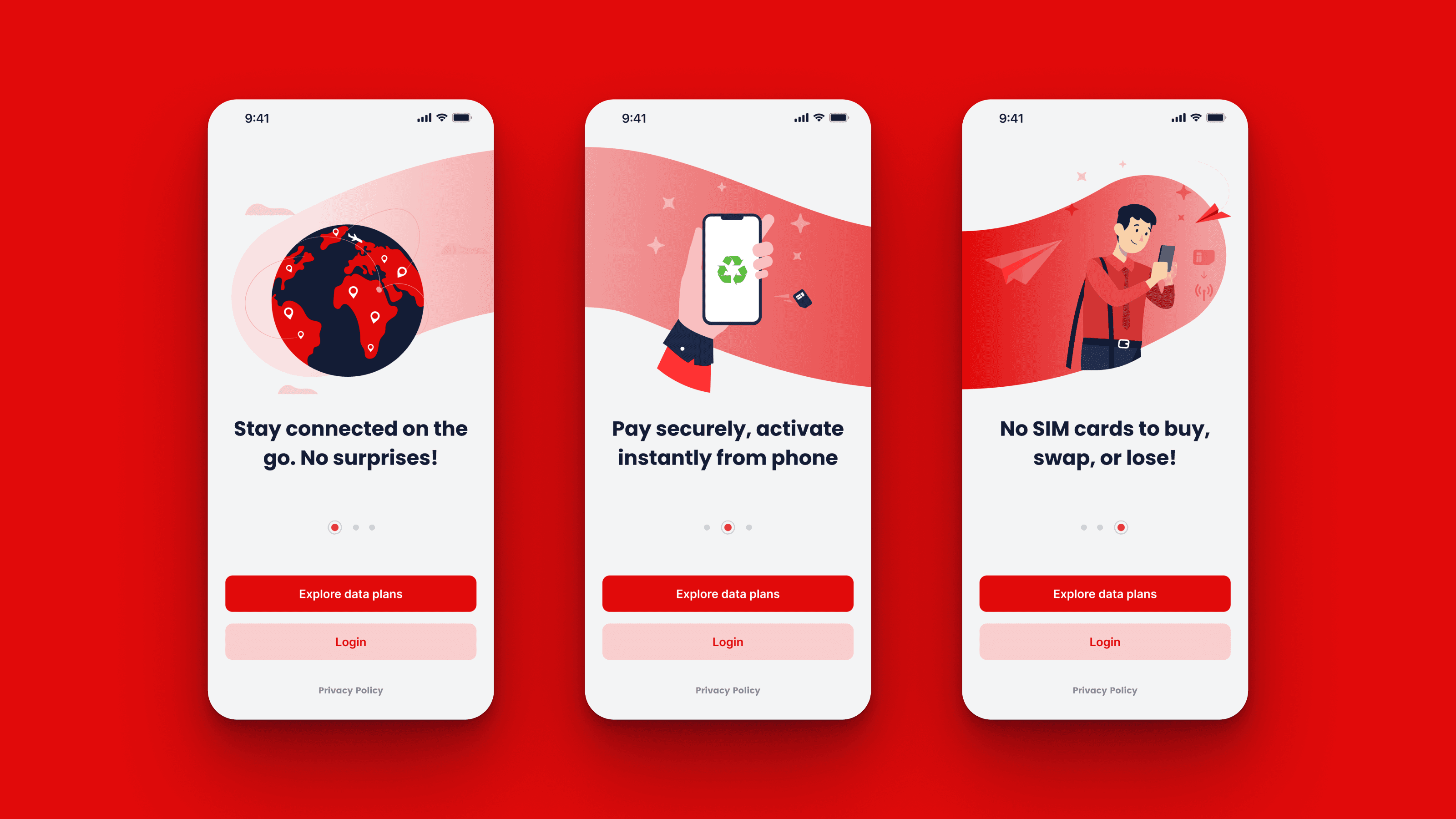
Three onboarding screens on Virgin red: stay connected, pay securely, no SIM cards to buy, swap or lose

The approach

I designed shared patterns for choosing a plan, buying data and installing an eSIM, with consistent components and guidance across iOS and Android.
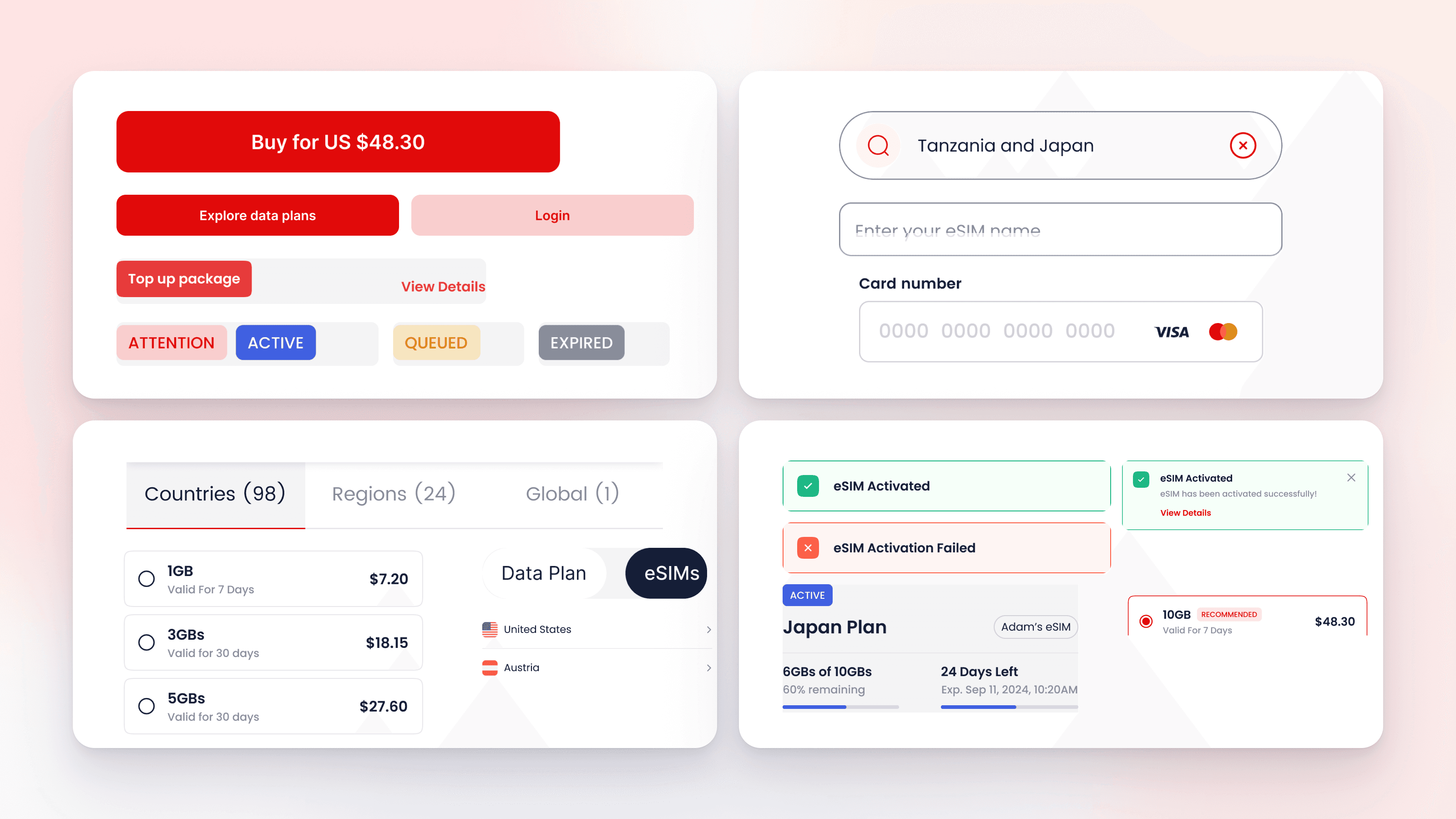
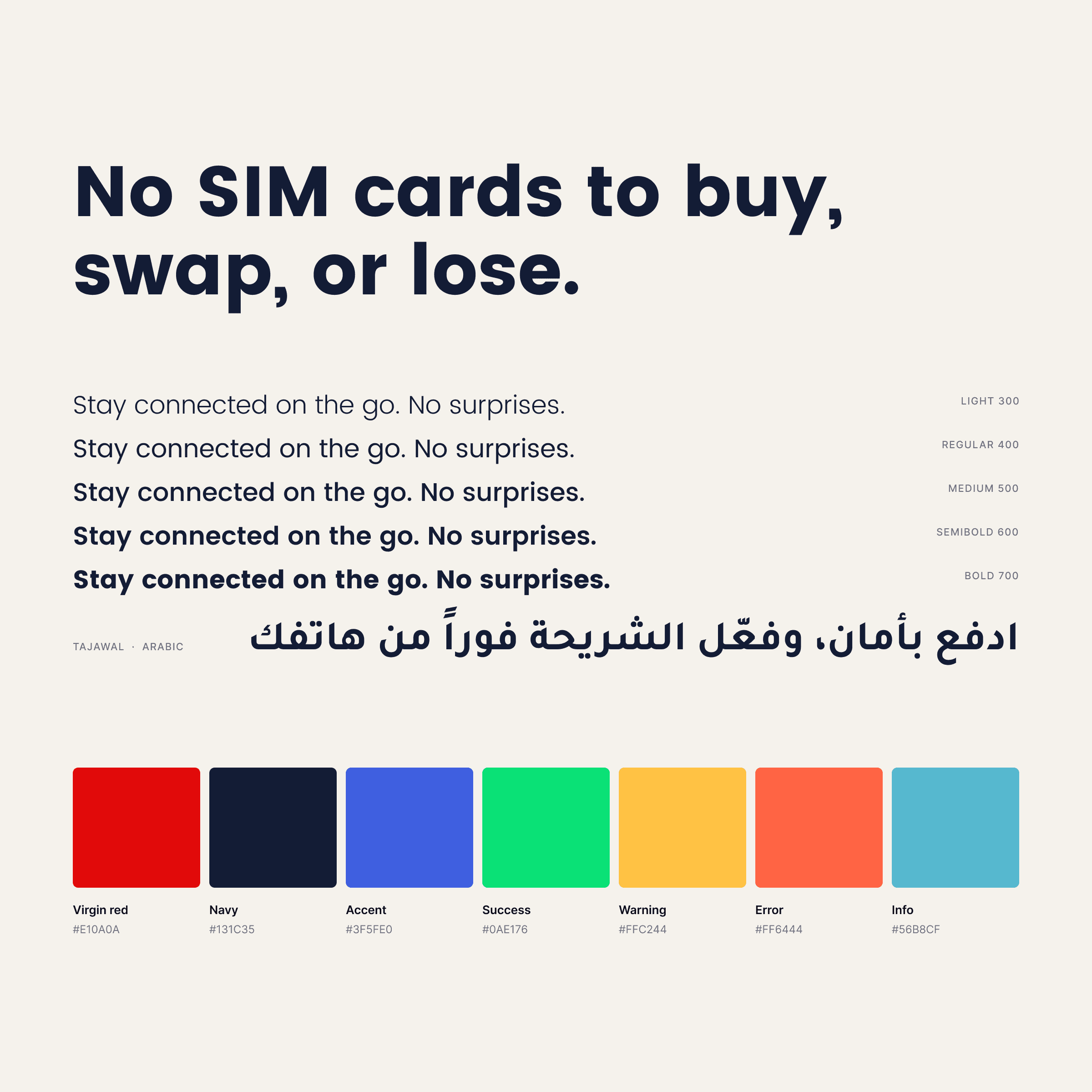
Component sheet with real content: buy button, status chips, search field, plan rows, country tabs and toastsType and colour specimen: Poppins in five weights, Tajawal for Arabic, and the seven interface colours

The experience

Make an eSIM feel non-technical

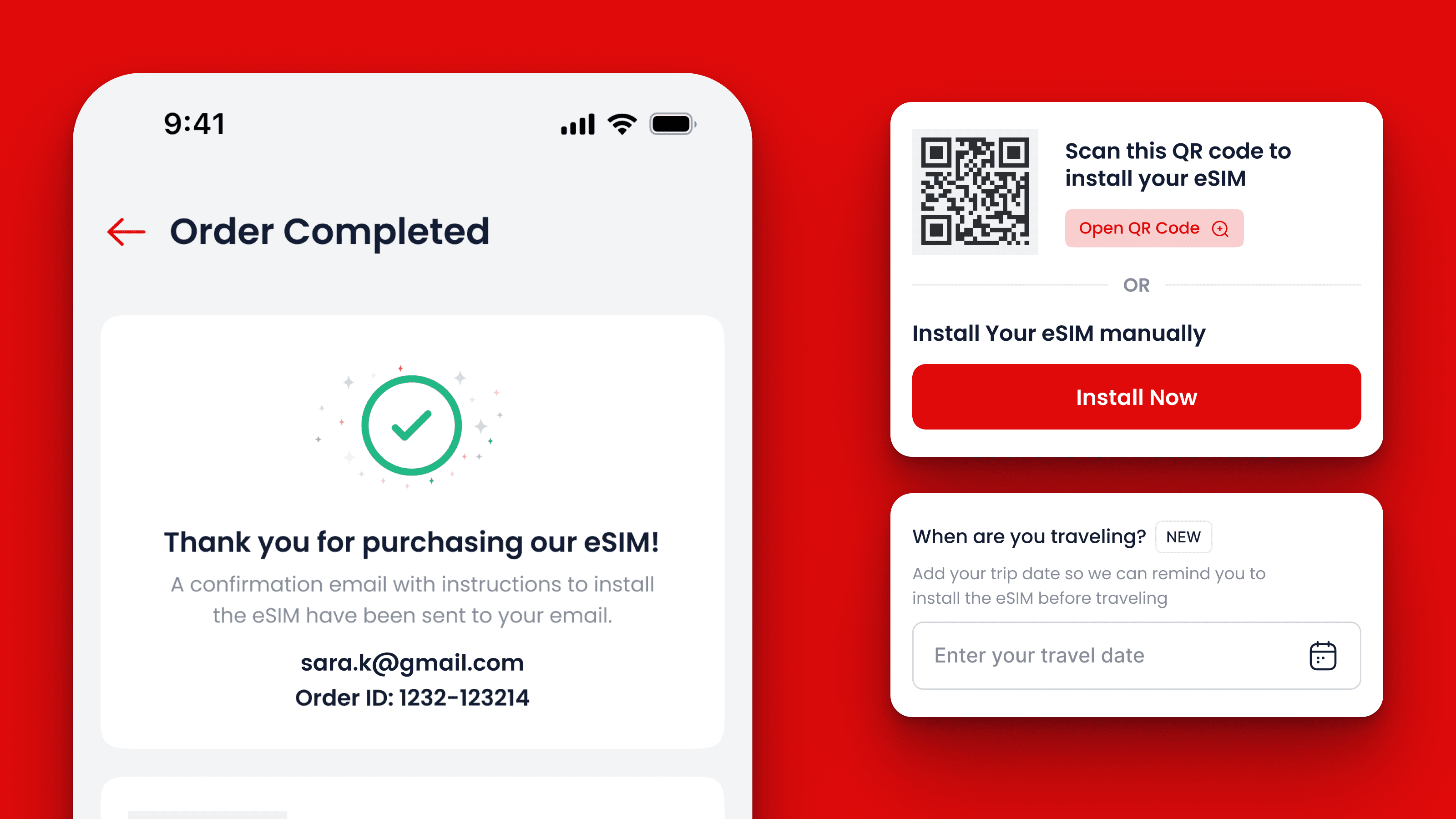
“Data only” became a sheet with the icons of the apps that still work. Plan details read as sentences. Installation is taught with the real iOS and Android settings screens, one step per page, and the order confirmation offers a QR code or a manual path, then asks when you travel so it can remind you to install before the flight.
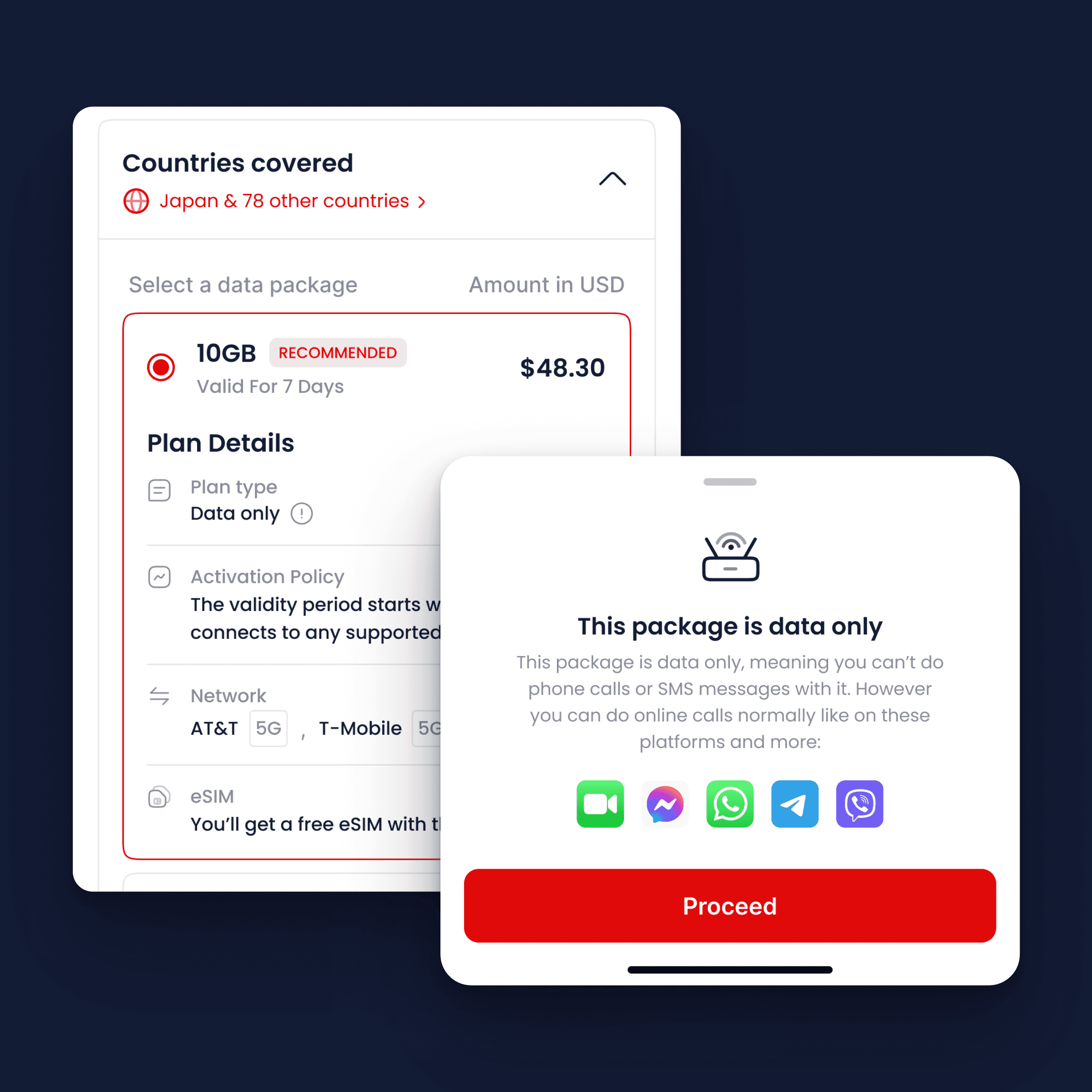
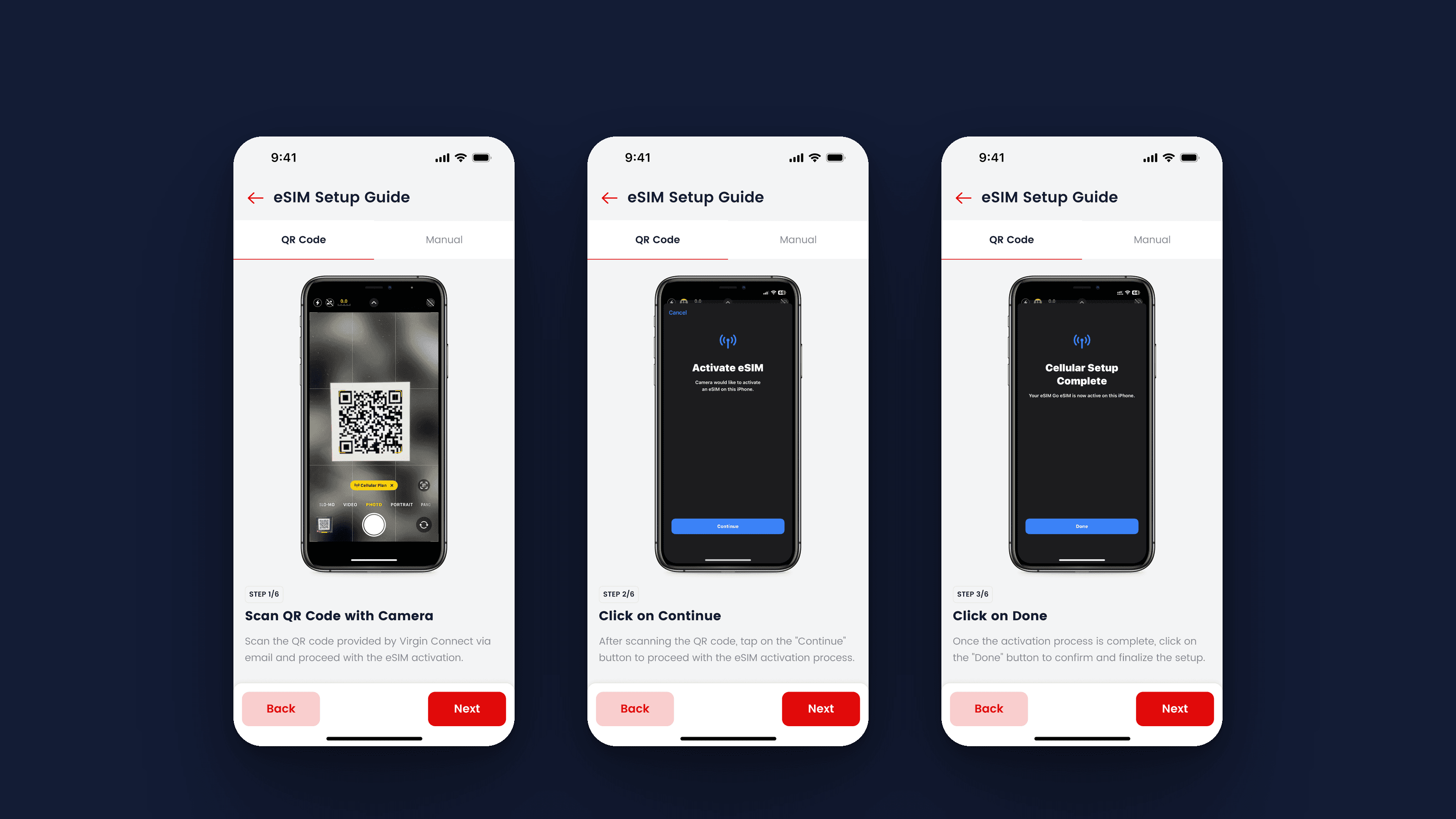
The plan list with the recommended row open, beside the sheet that explains data-only with app iconsThe iOS install guide, steps one to three: scan the QR code, activate the eSIM and finish setupSteps four to six: the default line for calls, the plan for iMessage and FaceTime, and the line for mobile dataOrder completed, with the QR panel, the manual install path and the travel-date reminder

Finding a plan

Home opens on a map with your country highlighted, then explore cards, recommendations and regions. Search is tabbed by country, region and global. Every plan list has one row marked recommended and pre-selected.

Destination cards for Japan, Tanzania and Egypt, an active package card and the region chipsSearch in three states: empty with the keyboard, recent searches, and results for a two-country query

Buying a plan

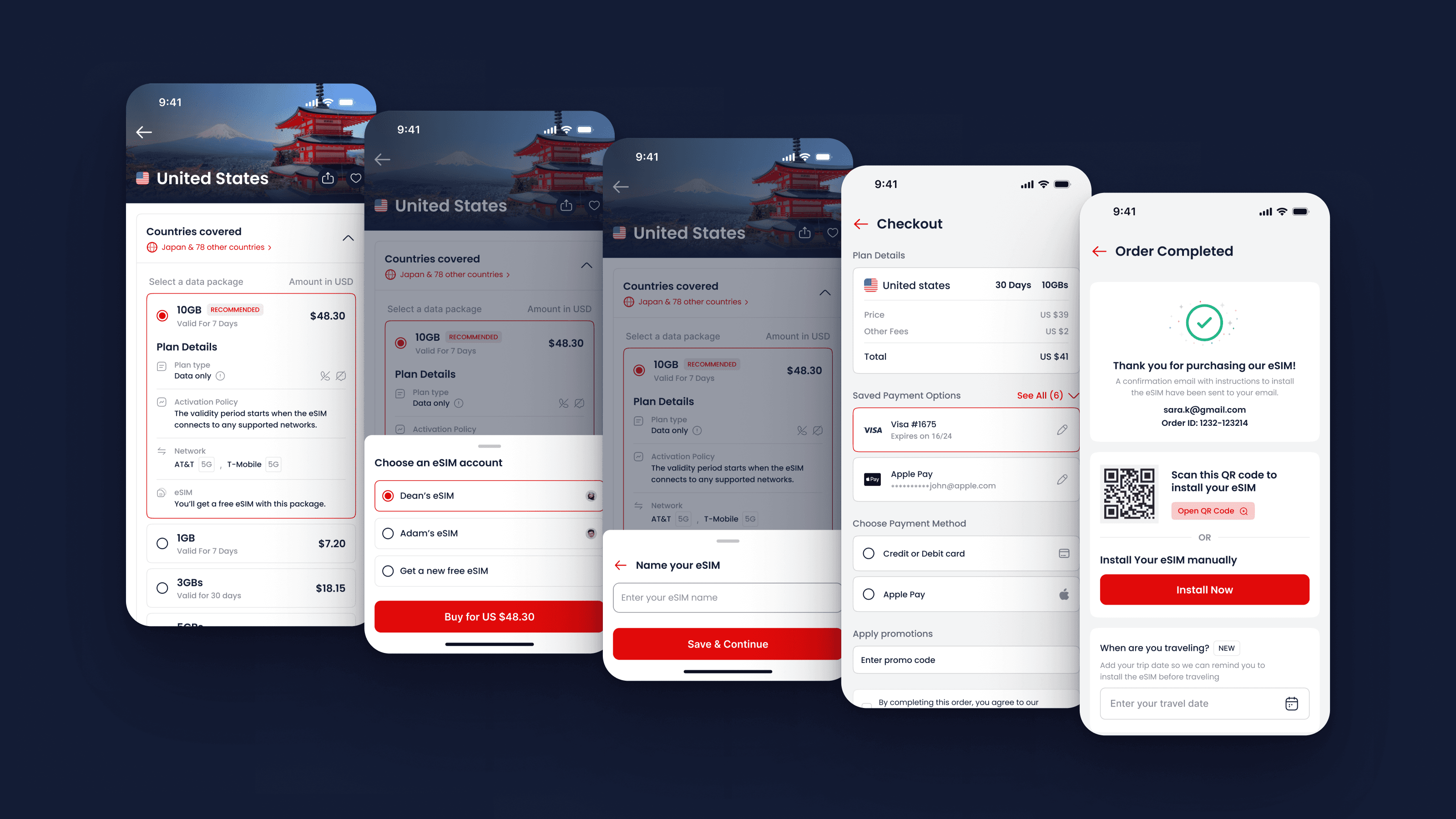
The purchase journey connects plan selection, the eSIM choice, checkout and confirmation, with saved cards and promo codes inside checkout.

Two sheets from the buying flow: choose which eSIM gets the plan, then name itCheckout in parts: plan summary, saved cards, add a card, payment method and promo codeThe five screens of a purchase, plan page through to order completed

Managing eSIMs

A purchase can use an existing eSIM or create a new one with its own name. My eSIMs shows attention, active, queued and expired states, each with a relevant next action. Usage alerts extend that guidance to the lock screen.

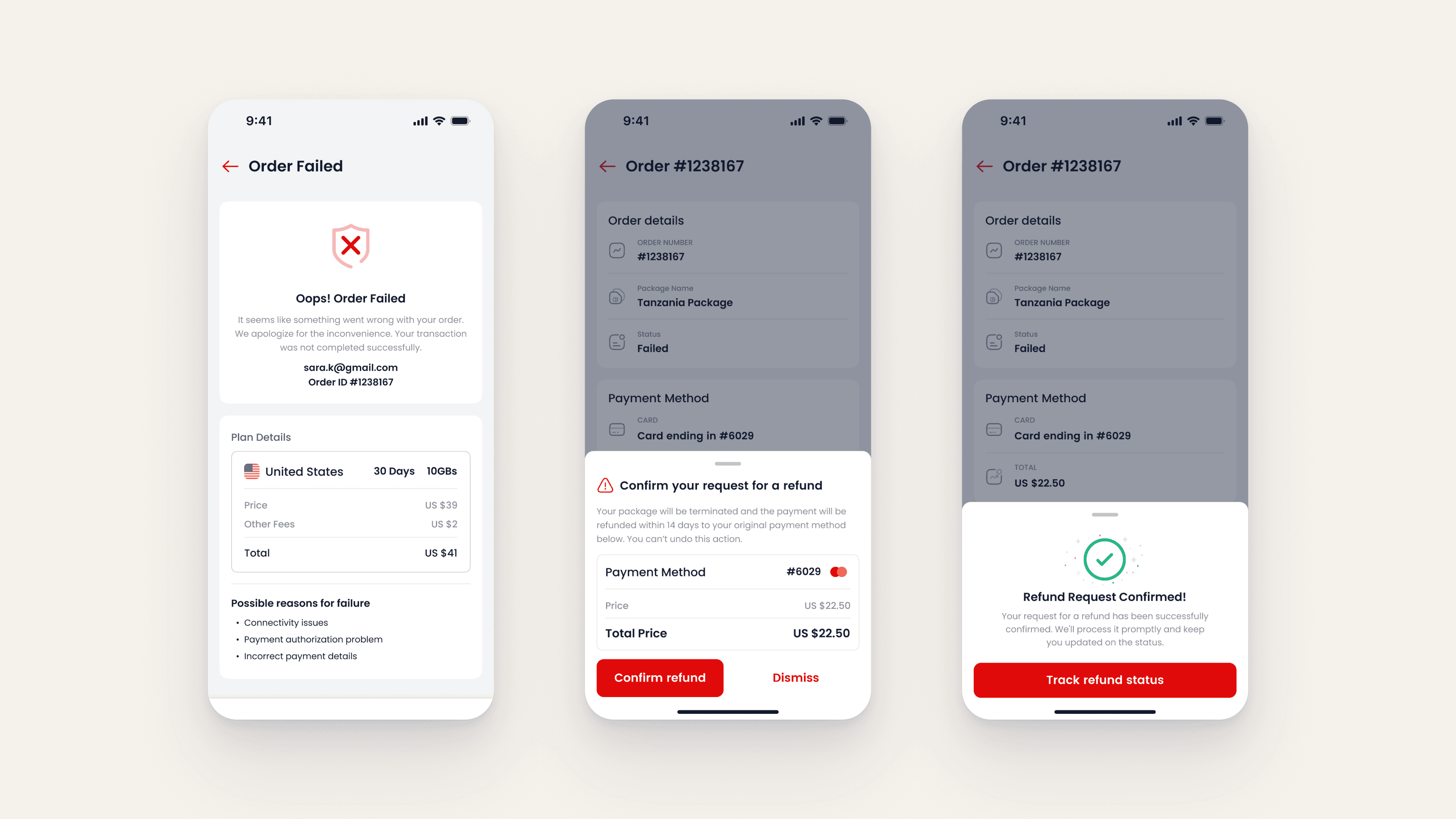
One plan card in four states: attention, active, queued and expired, each with its next actionUsage alerts on the lock screen at 50, 80 and 100 per cent, and the three banners largeThe unhappy path: order failed with its reasons, the refund request sheet, and the confirmation

An exploration

The animated home, 2023

Before the shipped home there was a concept where the map toured the destinations on its own: world view first, then Tanzania, Japan, Saudi Arabia and Montenegro, each with its card. Shown as an exploration, not as shipped UI.

One screen from the 2023 animated-home concept, the map mid-tour with its destination card

The outcome

The shipped experience connects discovery, purchase, installation and ongoing eSIM management. The animated home shown separately remains an exploration.

Credits

Product design, UX, design system and install guides: Sayed Essam. Client: Virgin Connect.

Request the PDF portfolio →

Image viewer

The challenge

Making connectivity understandable

A travel eSIM can leave a traveller with a QR code and technical instructions. The brief was to make buying data abroad feel familiar, from finding a plan to installation and managing multiple eSIMs.

Three onboarding screens on Virgin red: stay connected, pay securely, no SIM cards to buy, swap or lose

The approach

I designed shared patterns for choosing a plan, buying data and installing an eSIM, with consistent components and guidance across iOS and Android.

Component sheet with real content: buy button, status chips, search field, plan rows, country tabs and toastsType and colour specimen: Poppins in five weights, Tajawal for Arabic, and the seven interface colours

The experience

Make an eSIM feel non-technical

“Data only” became a sheet with the icons of the apps that still work. Plan details read as sentences. Installation is taught with the real iOS and Android settings screens, one step per page, and the order confirmation offers a QR code or a manual path, then asks when you travel so it can remind you to install before the flight.
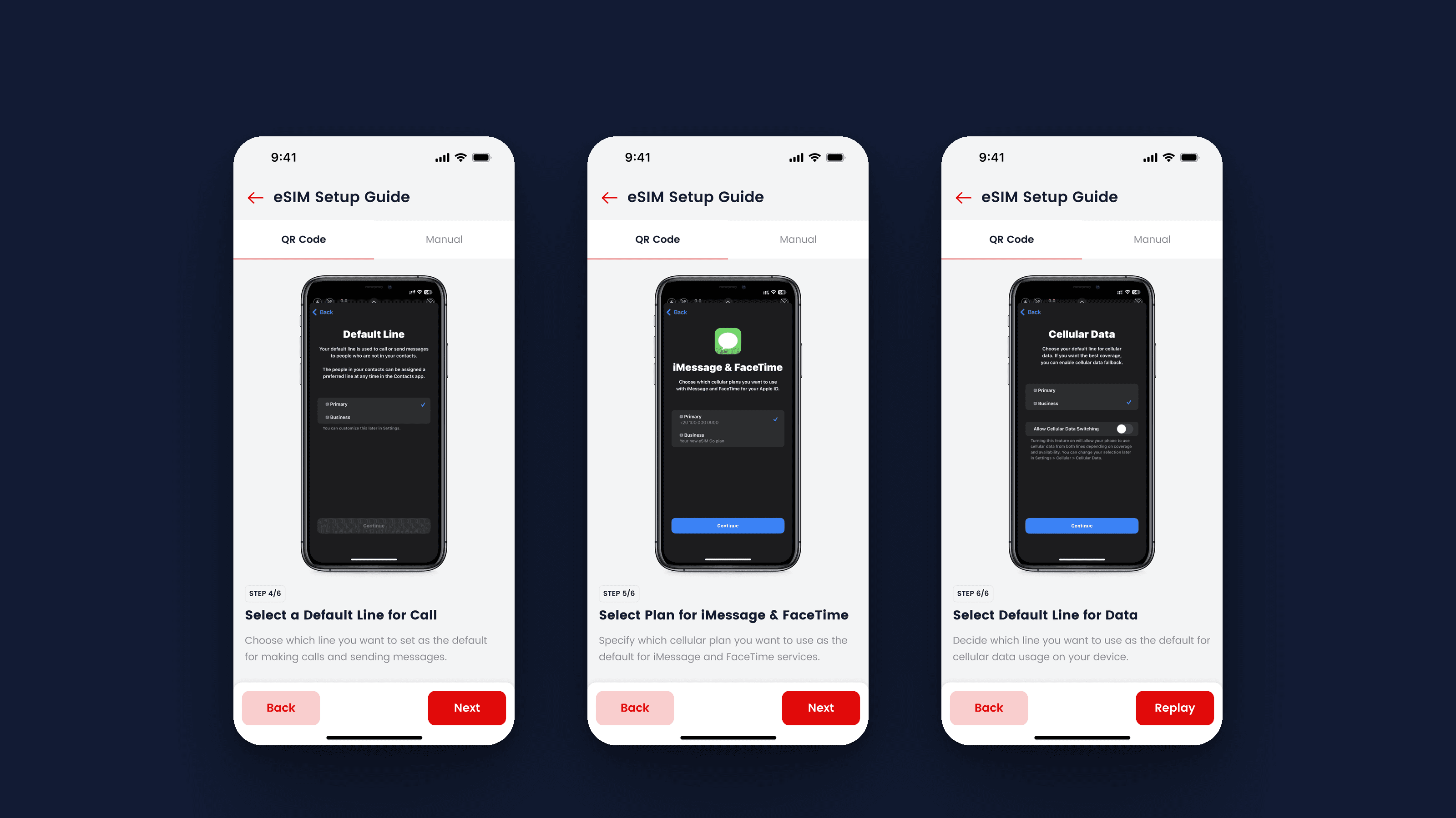
The plan list with the recommended row open, beside the sheet that explains data-only with app iconsThe iOS install guide, steps one to three: scan the QR code, activate the eSIM and finish setupSteps four to six: the default line for calls, the plan for iMessage and FaceTime, and the line for mobile dataOrder completed, with the QR panel, the manual install path and the travel-date reminder

Finding a plan

Home opens on a map with your country highlighted, then explore cards, recommendations and regions. Search is tabbed by country, region and global. Every plan list has one row marked recommended and pre-selected.
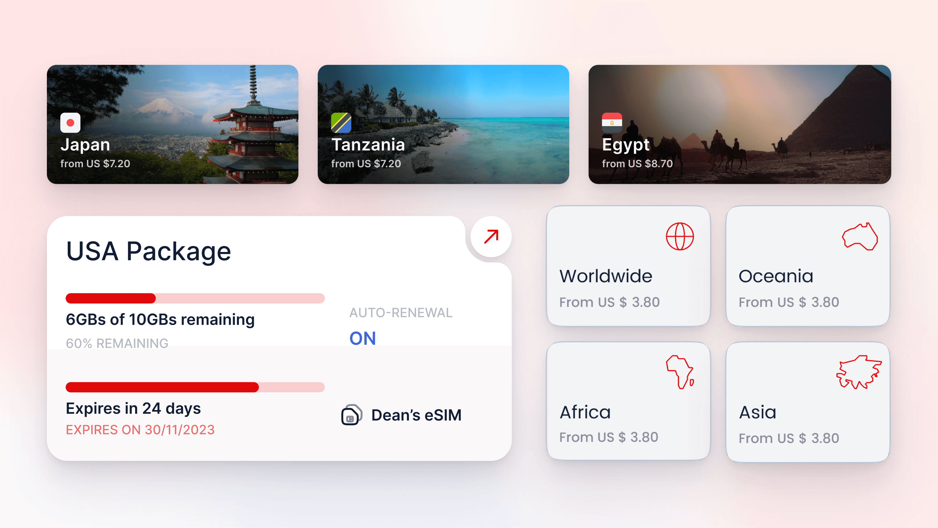
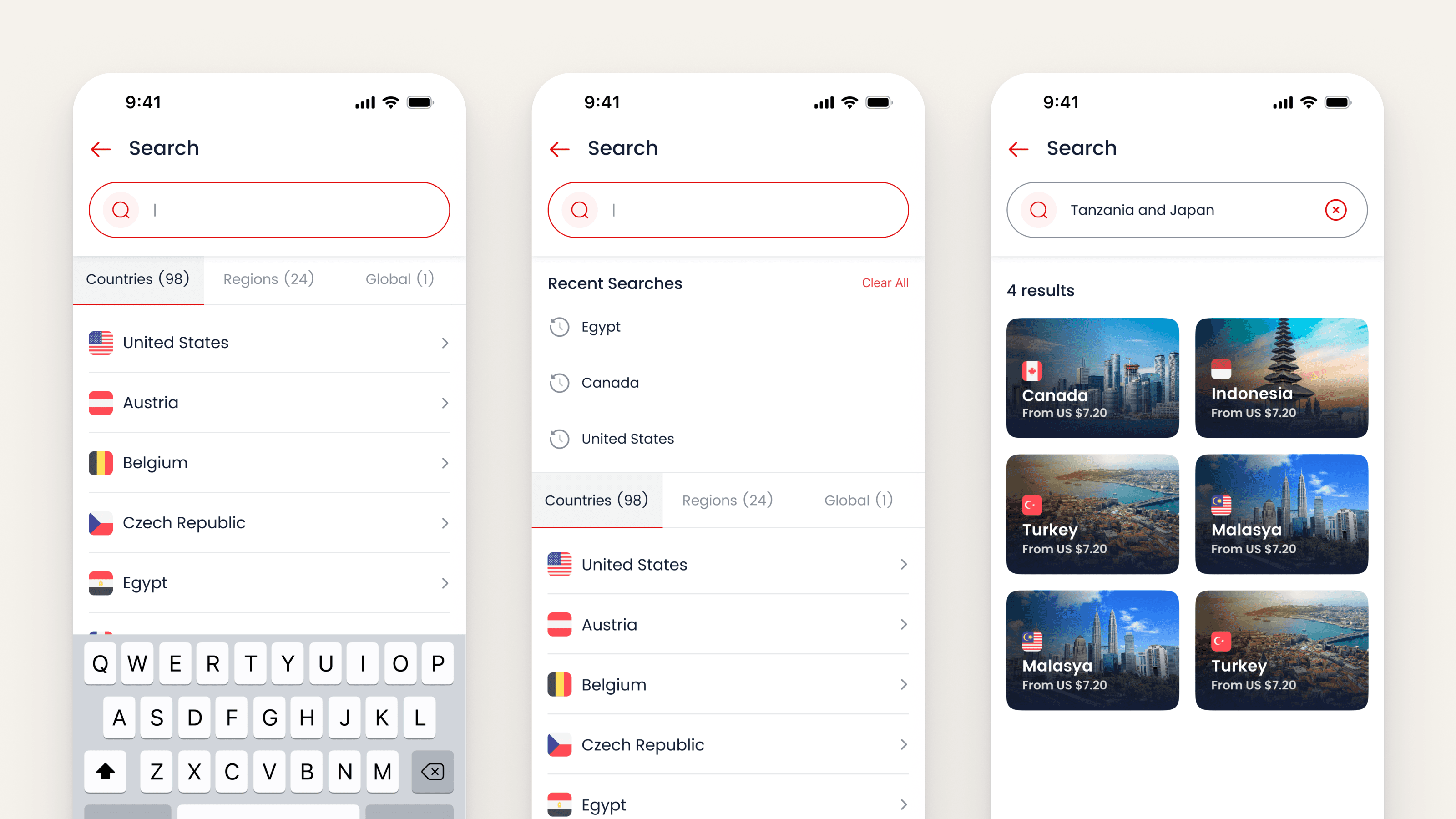
Destination cards for Japan, Tanzania and Egypt, an active package card and the region chipsSearch in three states: empty with the keyboard, recent searches, and results for a two-country query

Buying a plan

The purchase journey connects plan selection, the eSIM choice, checkout and confirmation, with saved cards and promo codes inside checkout.
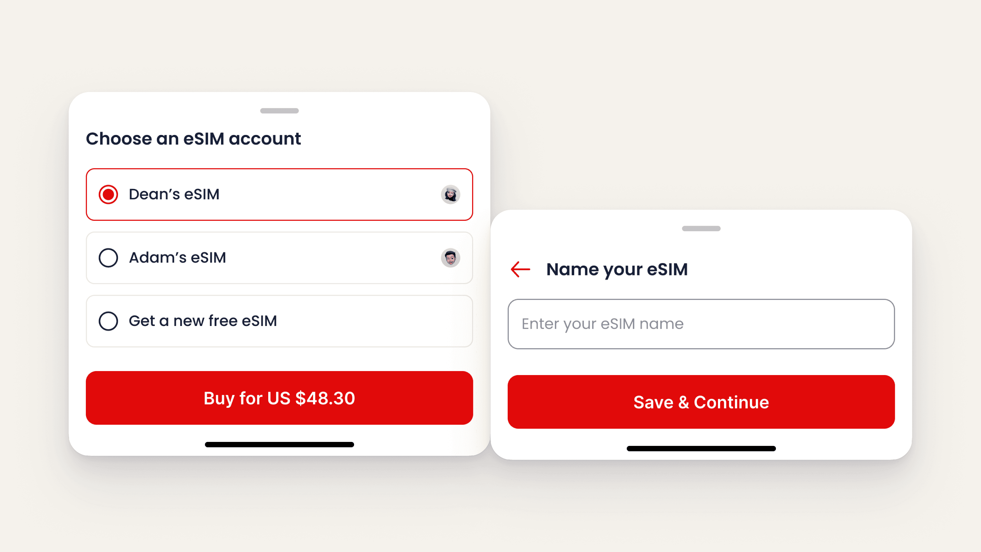
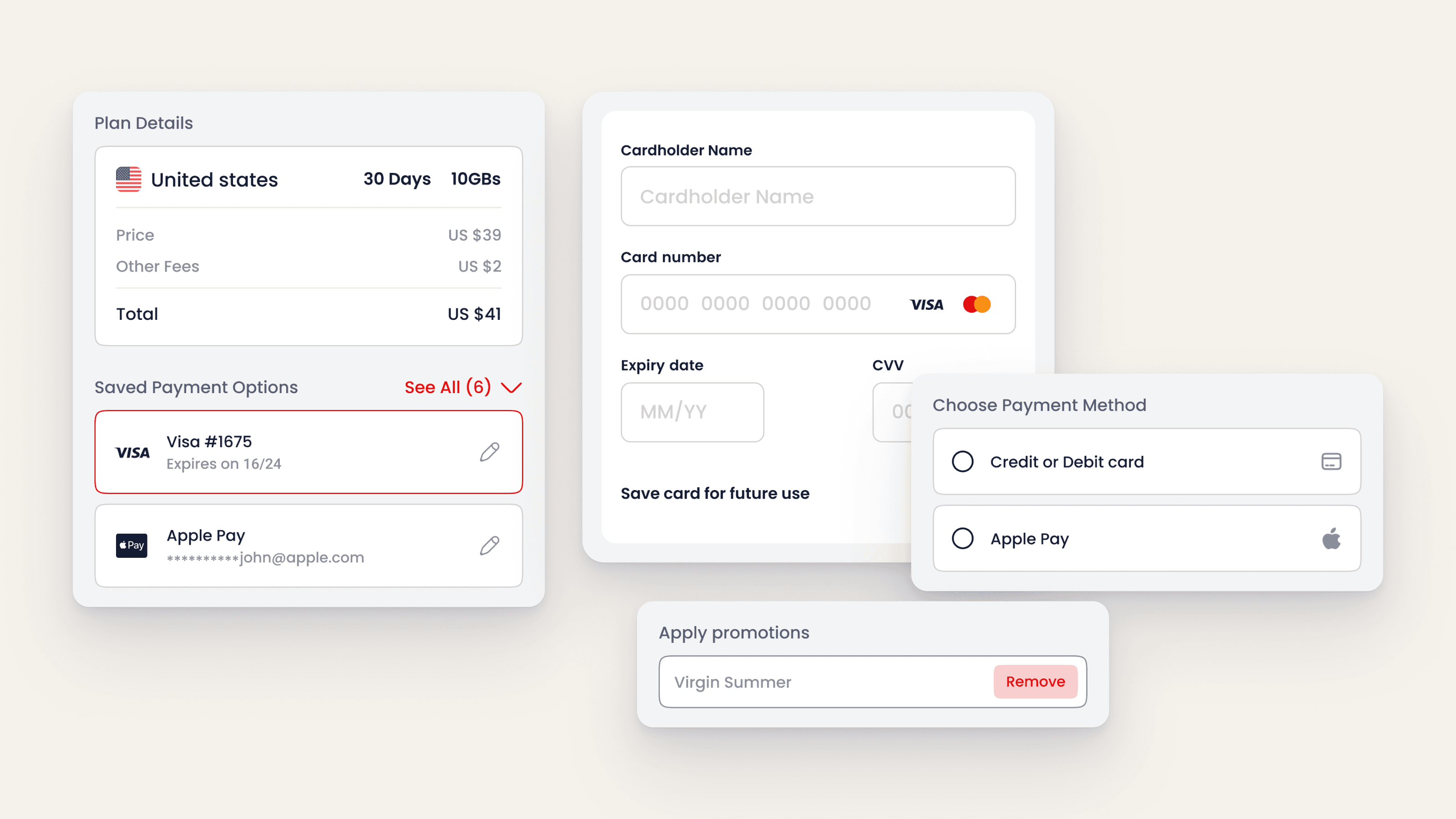
Two sheets from the buying flow: choose which eSIM gets the plan, then name itCheckout in parts: plan summary, saved cards, add a card, payment method and promo codeThe five screens of a purchase, plan page through to order completed

Managing eSIMs

A purchase can use an existing eSIM or create a new one with its own name. My eSIMs shows attention, active, queued and expired states, each with a relevant next action. Usage alerts extend that guidance to the lock screen.
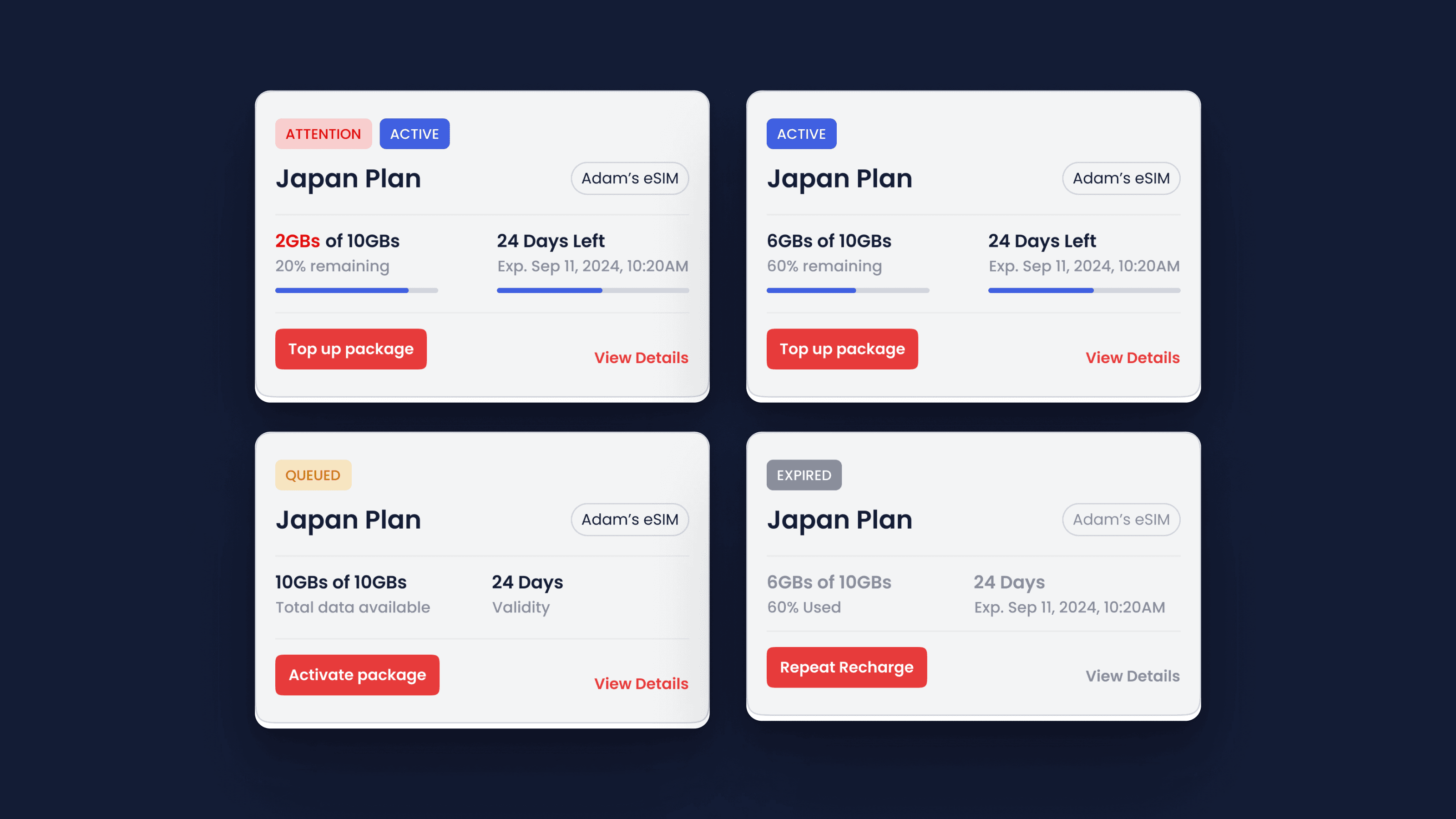
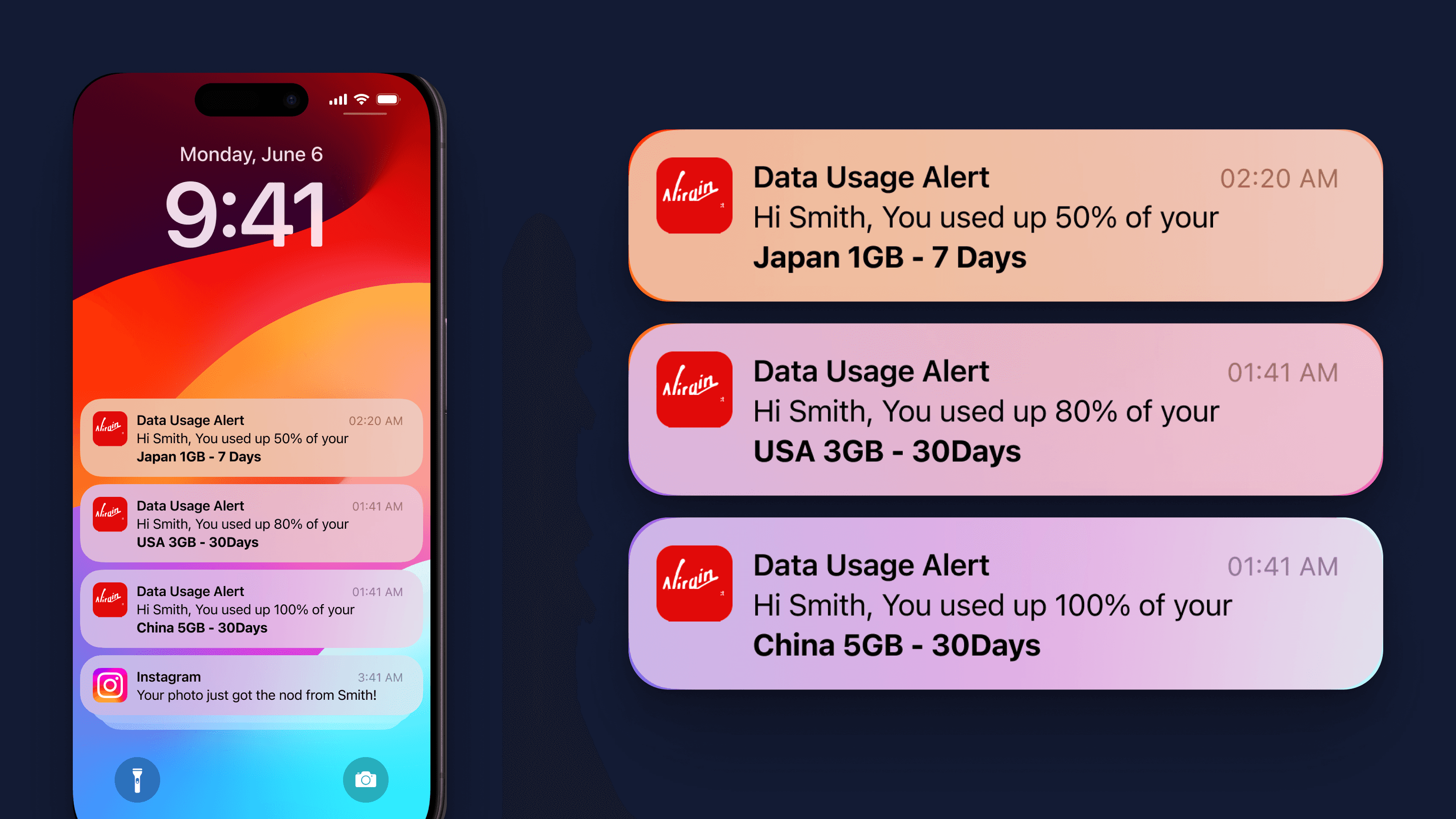
One plan card in four states: attention, active, queued and expired, each with its next actionUsage alerts on the lock screen at 50, 80 and 100 per cent, and the three banners largeThe unhappy path: order failed with its reasons, the refund request sheet, and the confirmation

An exploration

The animated home, 2023

Before the shipped home there was a concept where the map toured the destinations on its own: world view first, then Tanzania, Japan, Saudi Arabia and Montenegro, each with its card. Shown as an exploration, not as shipped UI.
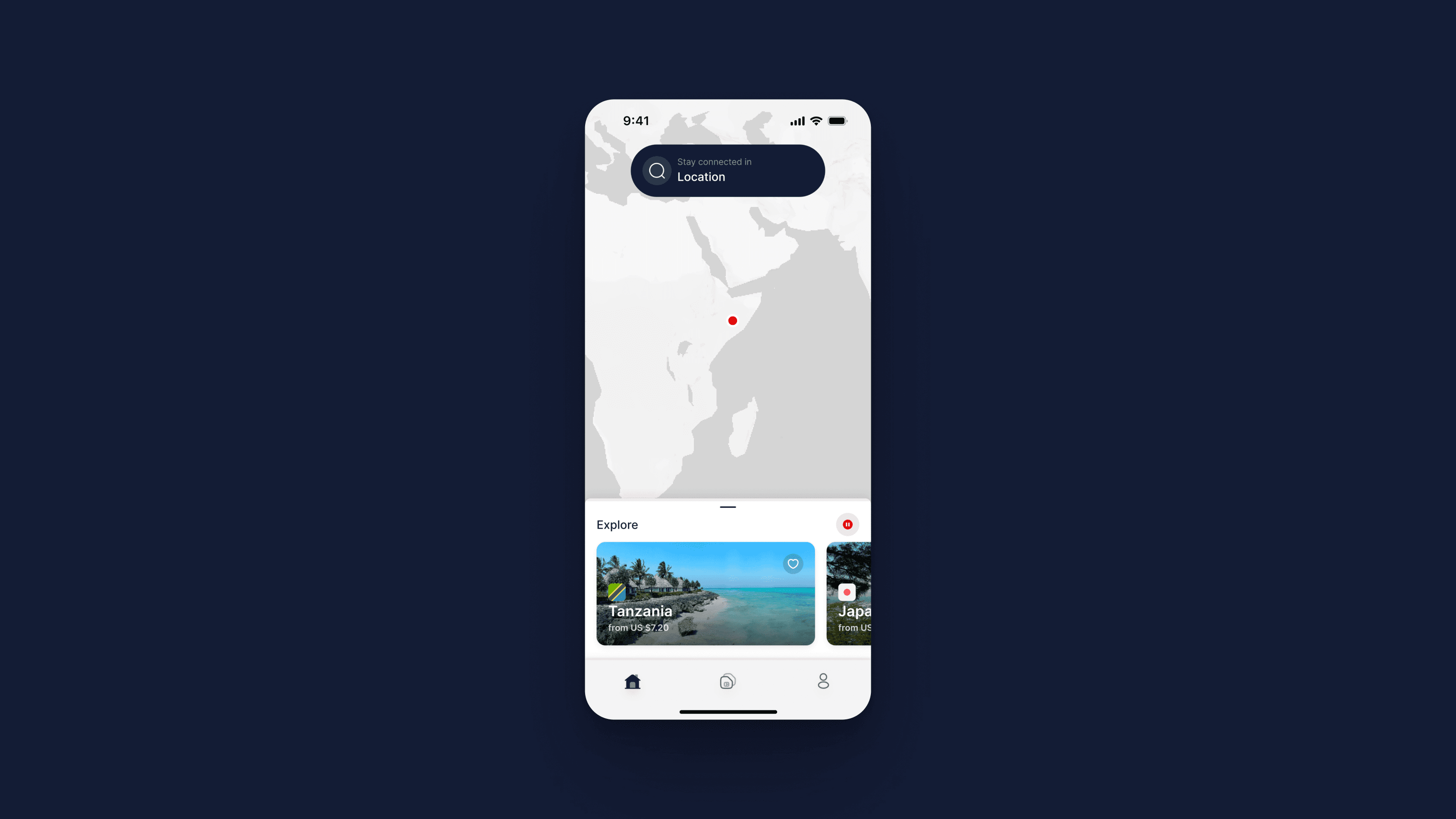
One screen from the 2023 animated-home concept, the map mid-tour with its destination card

The outcome

The shipped experience connects discovery, purchase, installation and ongoing eSIM management. The animated home shown separately remains an exploration.

Credits

Product design, UX, design system and install guides: Sayed Essam. Client: Virgin Connect.

Request the PDF portfolio →

Image viewer

Up next

Sakneen

Real estate · Product design

Let’s make it better.

Starting something new, growing a startup, or moving an established company forward? I can help shape the product, the systems, and the team behind it.

Two ways in

Cairo--:--

Available for collabs

© 2026 Syd — Sayed Essam

Designing for humans since 2014