The challenge
A history to work with
Jamjoom Medicine Store needed a corporate website in English and Arabic. The design had to communicate the company’s identity and history while the final copy was still being developed.
The approach
From illustration to photography
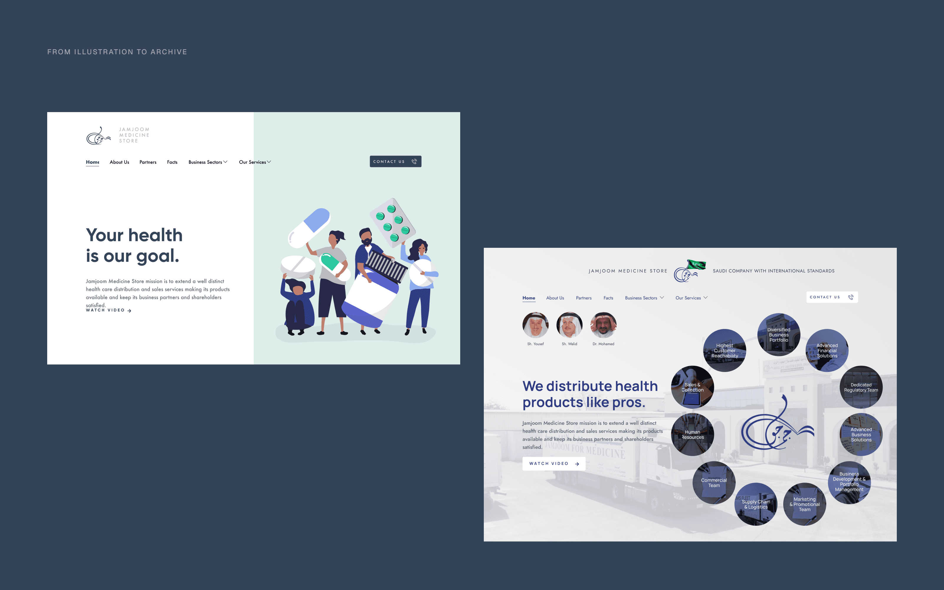
The early direction used illustration, mint and navy, and could have belonged to any distributor. The direction that launched drew instead on the company’s own photographic archive, arranging the images around the calligraphy of its name.
The experience
The archive on the page
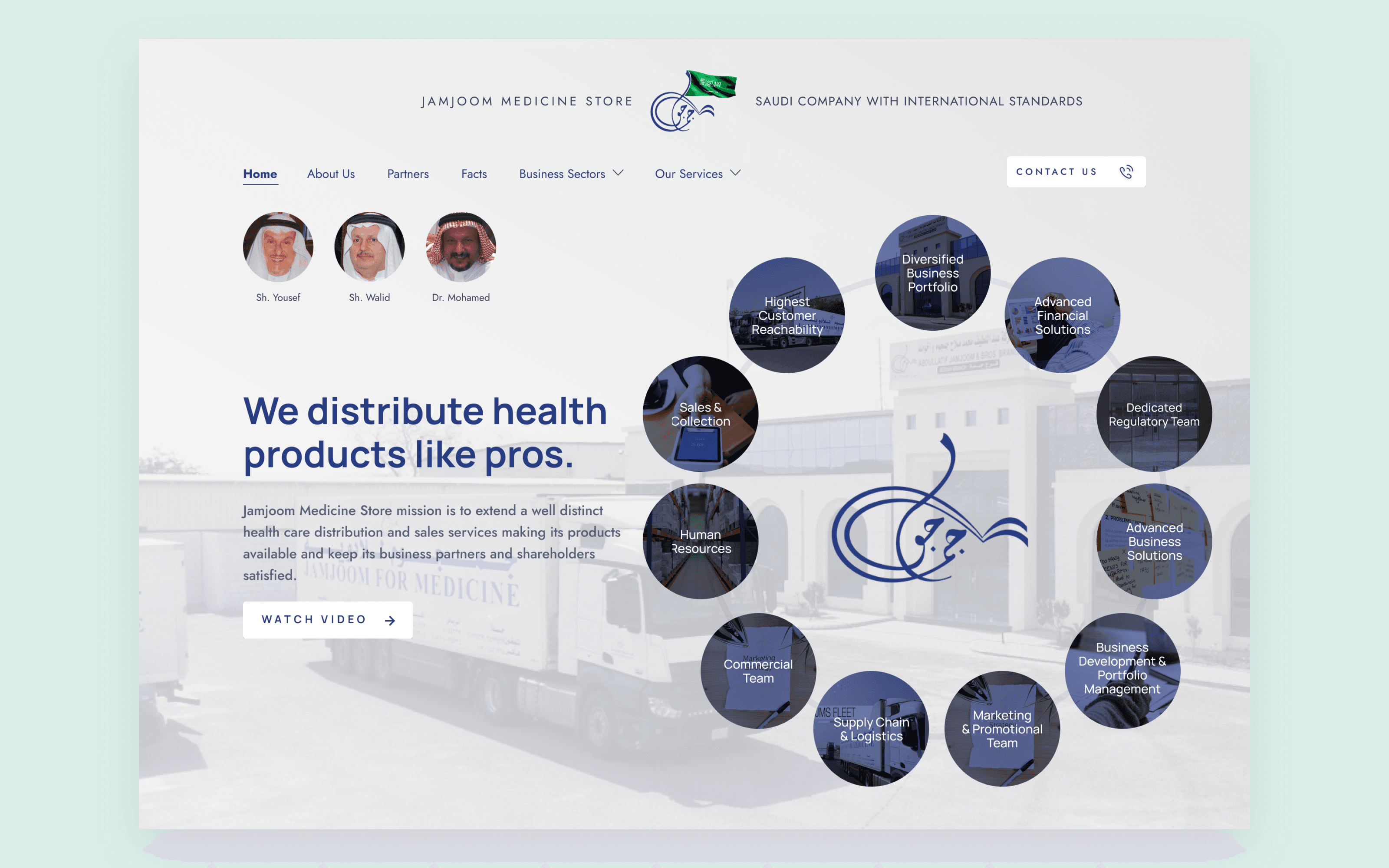
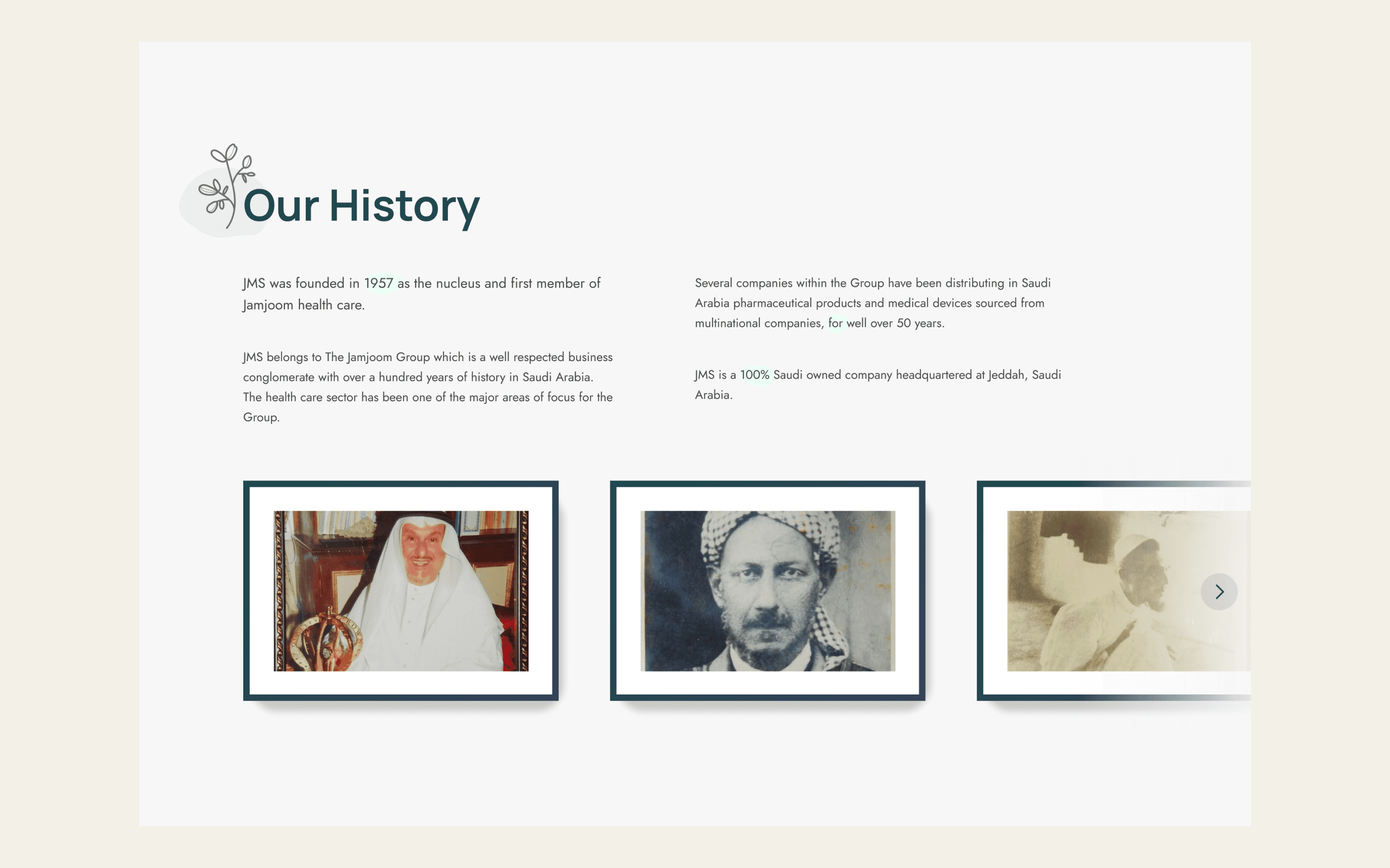
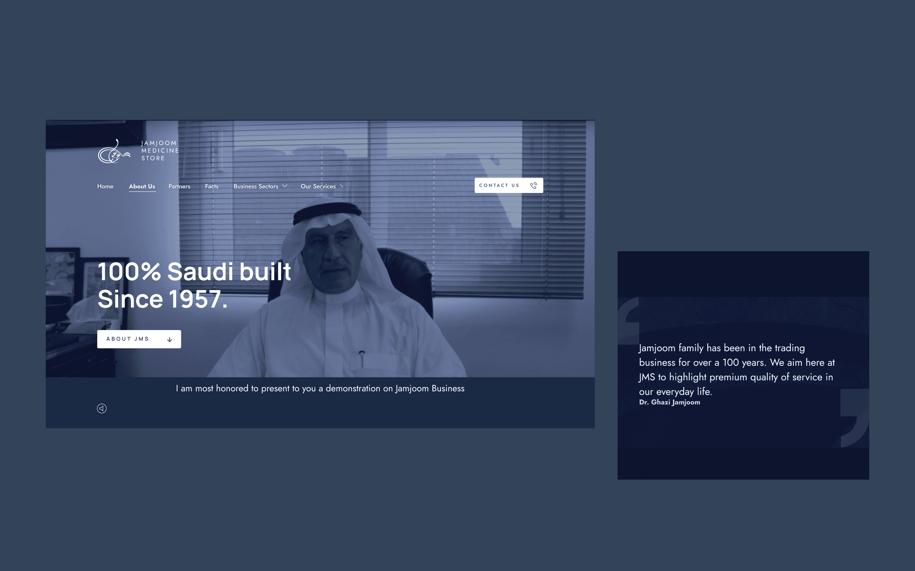
Photographic circles surround the Arabic wordmark, while the history section uses framed archival prints. The visual material gives the company’s story a presence before visitors read the detail.
Arabic layout
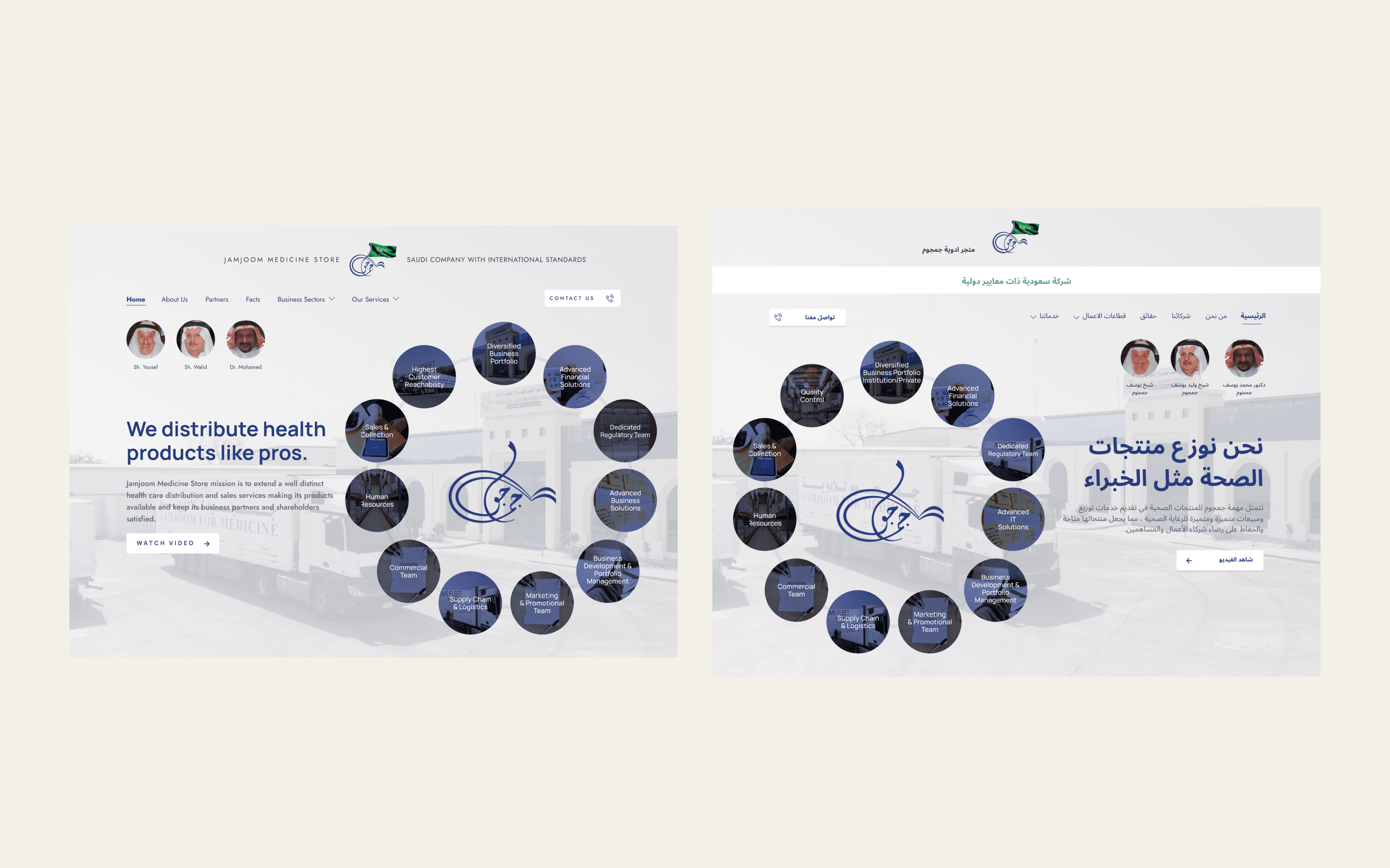
The Arabic layout changes navigation direction, image placement and headline alignment. The page established a pattern that could carry across both languages.
The outcome
The website launched and has since been replaced. Its design brought the company’s archive, identity and bilingual layout into a consistent presentation.
Credits
Website design: Sayed Essam. Brand identity: supplied. Photography: client archive and stock imagery. Client: Jamjoom Medicine Store.
The challenge
A history to work with
Jamjoom Medicine Store needed a corporate website in English and Arabic. The design had to communicate the company’s identity and history while the final copy was still being developed.
The approach
From illustration to photography
The early direction used illustration, mint and navy, and could have belonged to any distributor. The direction that launched drew instead on the company’s own photographic archive, arranging the images around the calligraphy of its name.
The experience
The archive on the page
Photographic circles surround the Arabic wordmark, while the history section uses framed archival prints. The visual material gives the company’s story a presence before visitors read the detail.
Arabic layout
The Arabic layout changes navigation direction, image placement and headline alignment. The page established a pattern that could carry across both languages.
The outcome
The website launched and has since been replaced. Its design brought the company’s archive, identity and bilingual layout into a consistent presentation.
Credits
Website design: Sayed Essam. Brand identity: supplied. Photography: client archive and stock imagery. Client: Jamjoom Medicine Store.