The challenge
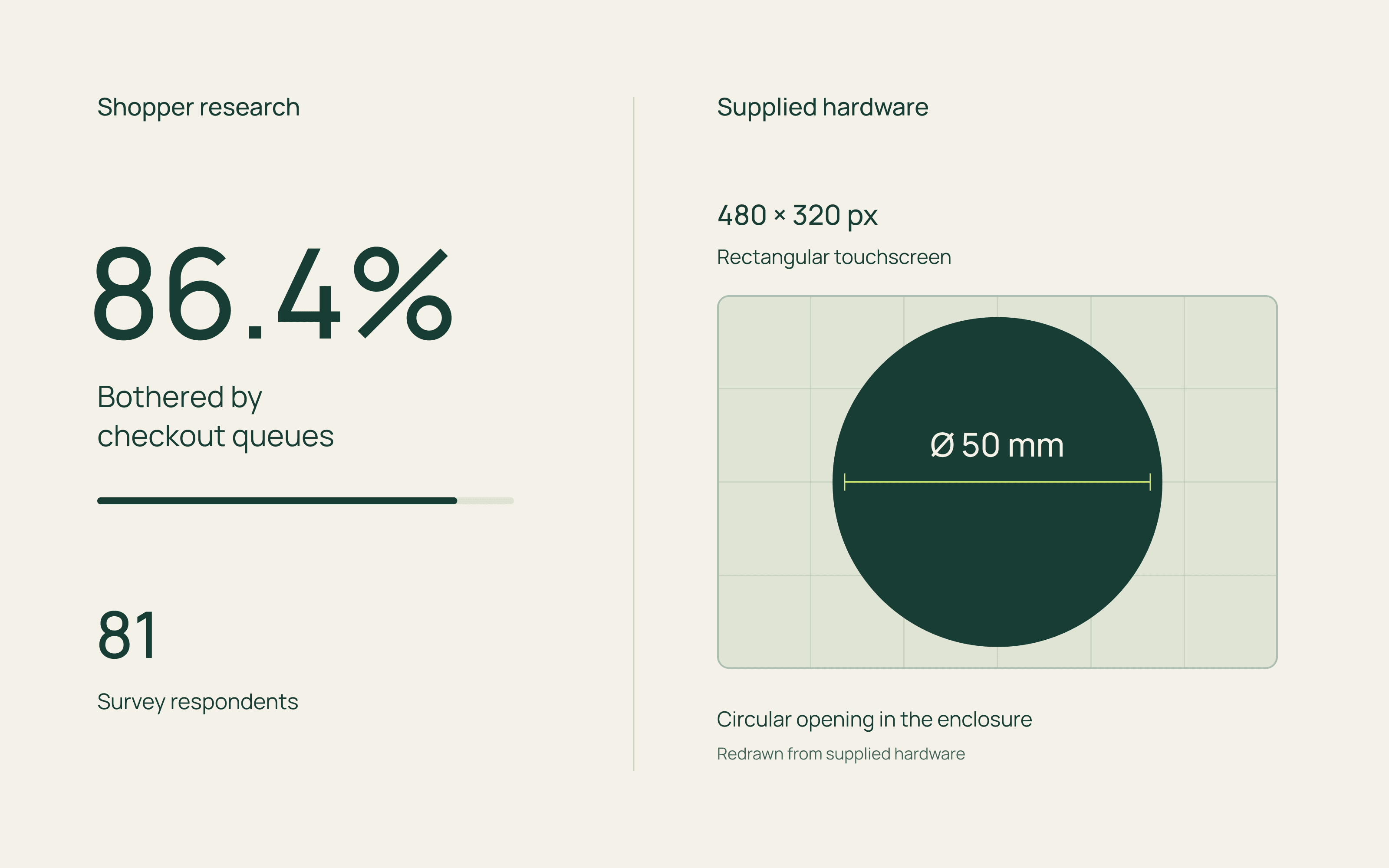
The brief was to help shoppers scan groceries and pay from their trolley without joining the checkout queue. I contributed to shopper research and designed the experience around a small touchscreen behind a circular opening.
The approach
Working inside a circle
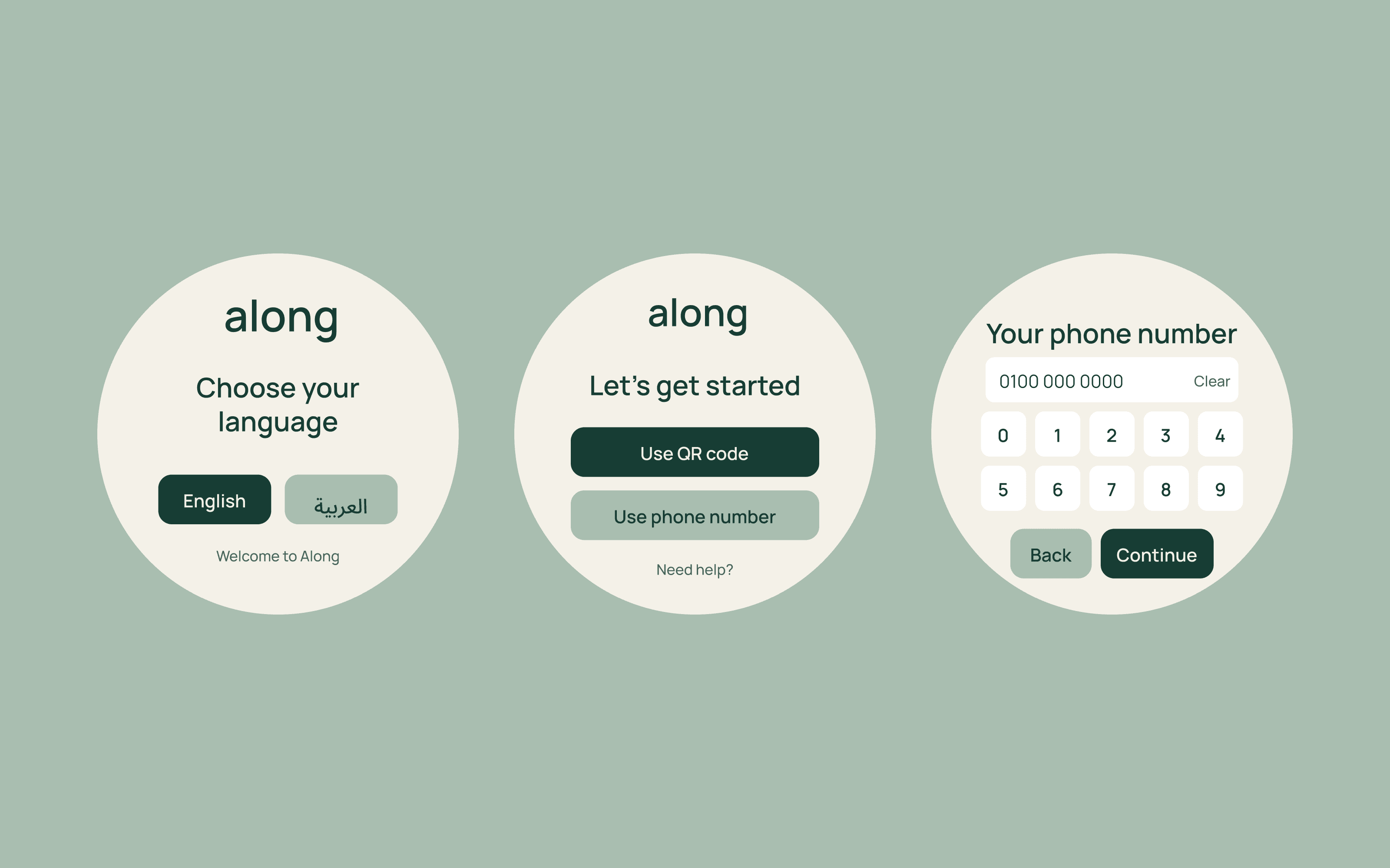
The enclosure shaped the layout. Login and numeric entry used the wider centre of the display, with separate states for registration, confirmation and recovery.
The experience
Making each scan clear
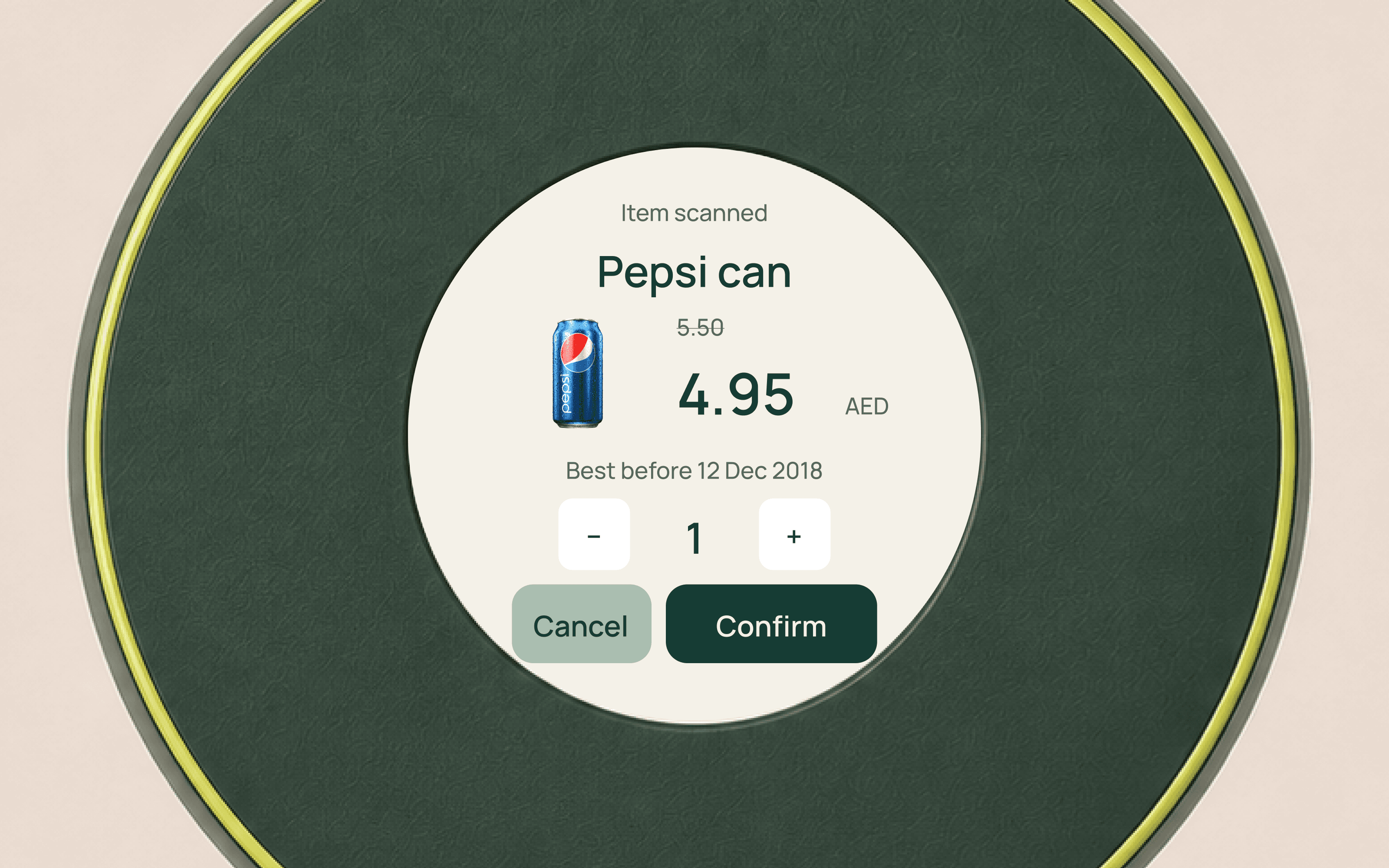
The scan screen brought the product, price and expiry date together, with quantity controls and clear confirmation before adding it to the basket.
Keeping checkout close
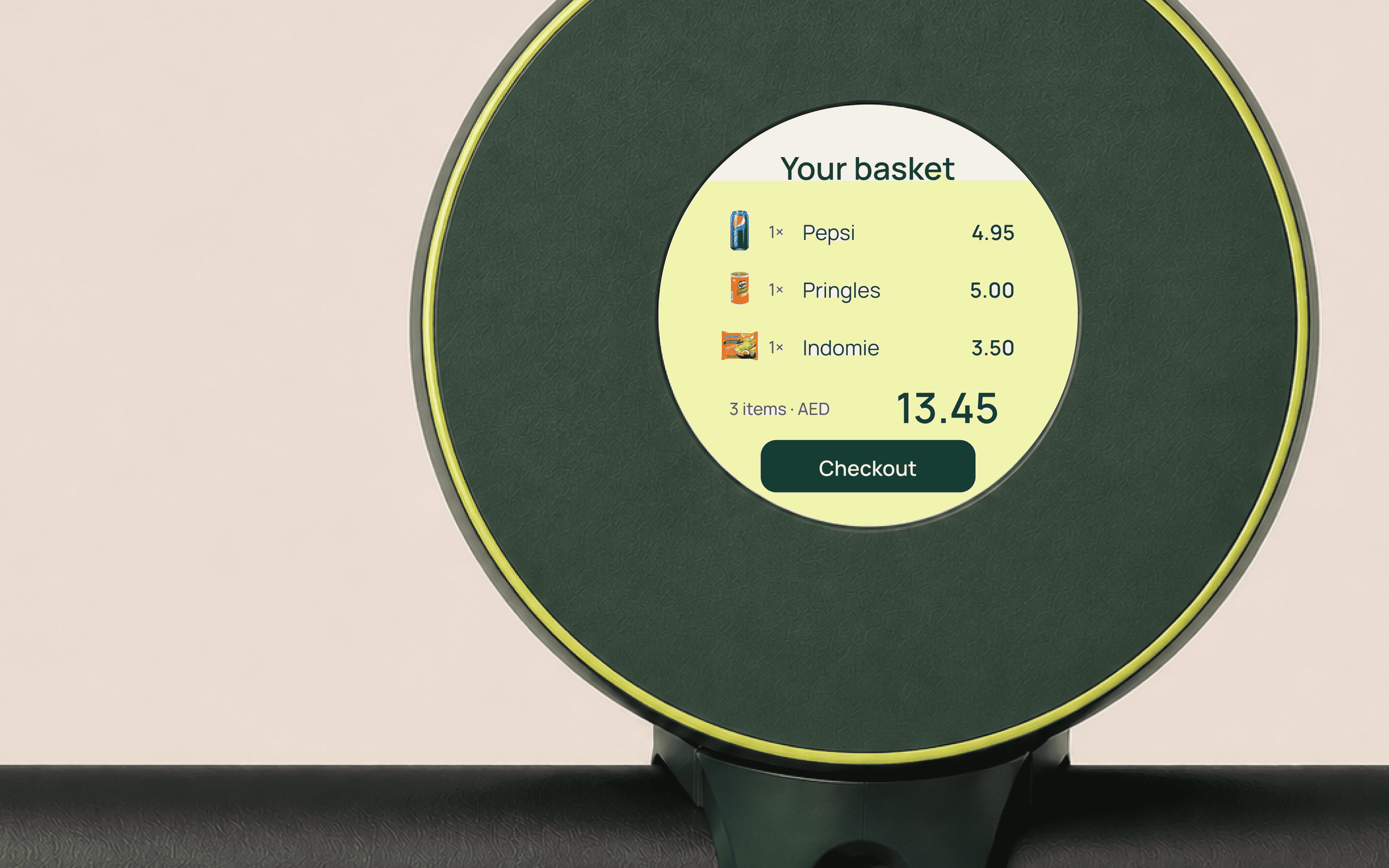
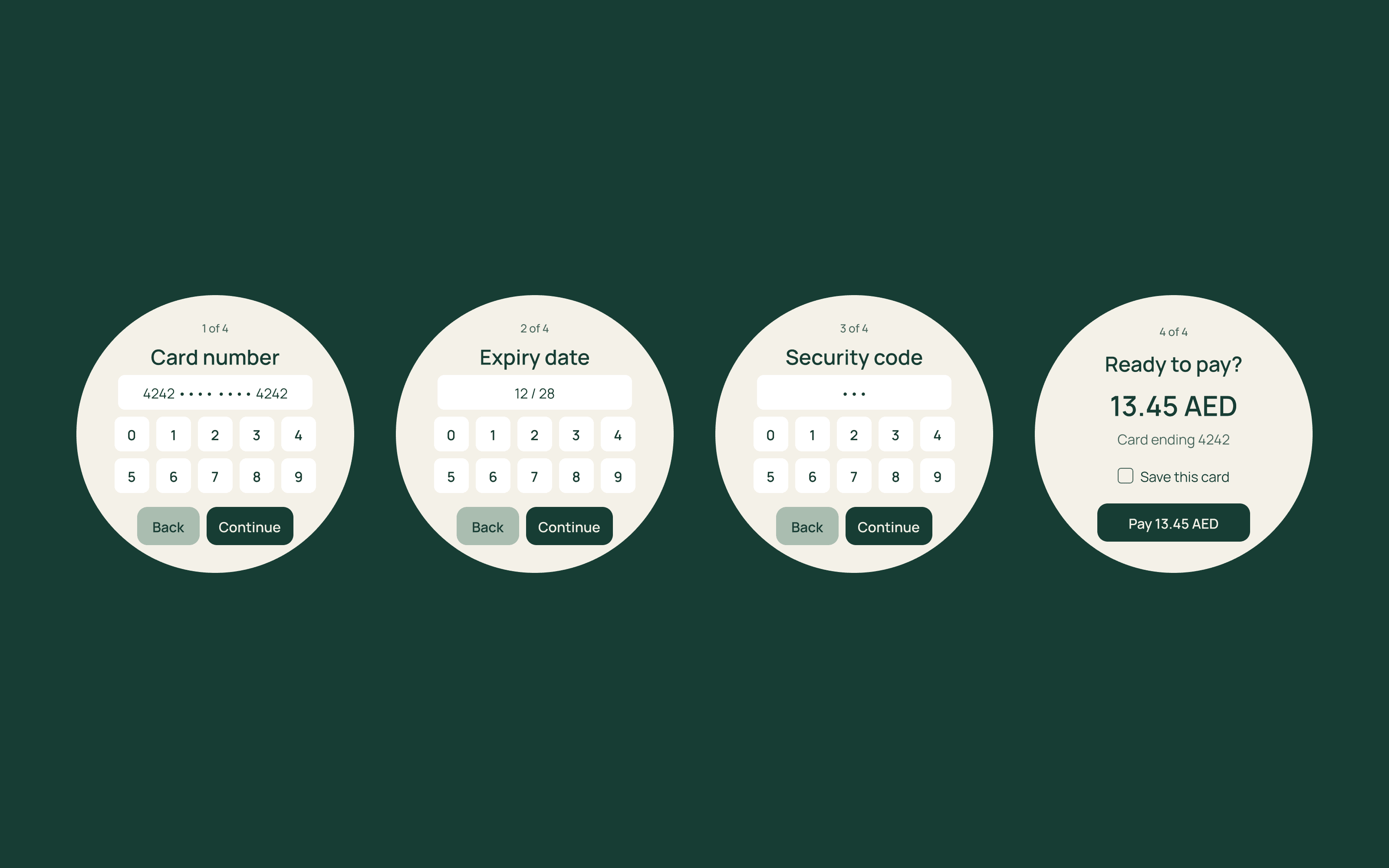
The basket kept its total and checkout action with the product list. Card entry unfolded one question at a time, giving each step room on the small display.
Learning with shoppers
Shoppers tried a clickable prototype. Their feedback went into the controls: larger tap targets, and buttons repositioned within the circular display, before handoff.
The outcome
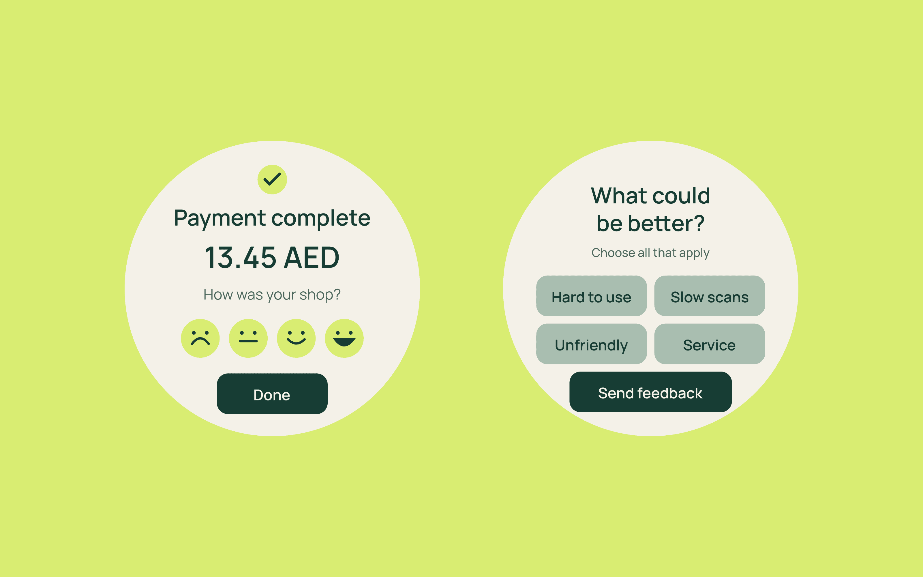
The project ended at design handoff, covering entry, scanning, basket review, payment and feedback.
Credits
UX and UI design: Sayed Essam, the sole designer on the project. Collaboration: the founders and engineers. Branding and hardware were supplied.
The challenge
The brief was to help shoppers scan groceries and pay from their trolley without joining the checkout queue. I contributed to shopper research and designed the experience around a small touchscreen behind a circular opening.
The approach
Working inside a circle
The enclosure shaped the layout. Login and numeric entry used the wider centre of the display, with separate states for registration, confirmation and recovery.
The experience
Making each scan clear
The scan screen brought the product, price and expiry date together, with quantity controls and clear confirmation before adding it to the basket.
Keeping checkout close
The basket kept its total and checkout action with the product list. Card entry unfolded one question at a time, giving each step room on the small display.
Learning with shoppers
Shoppers tried a clickable prototype. Their feedback went into the controls: larger tap targets, and buttons repositioned within the circular display, before handoff.
The outcome
The project ended at design handoff, covering entry, scanning, basket review, payment and feedback.
Credits
UX and UI design: Sayed Essam, the sole designer on the project. Collaboration: the founders and engineers. Branding and hardware were supplied.