The challenge
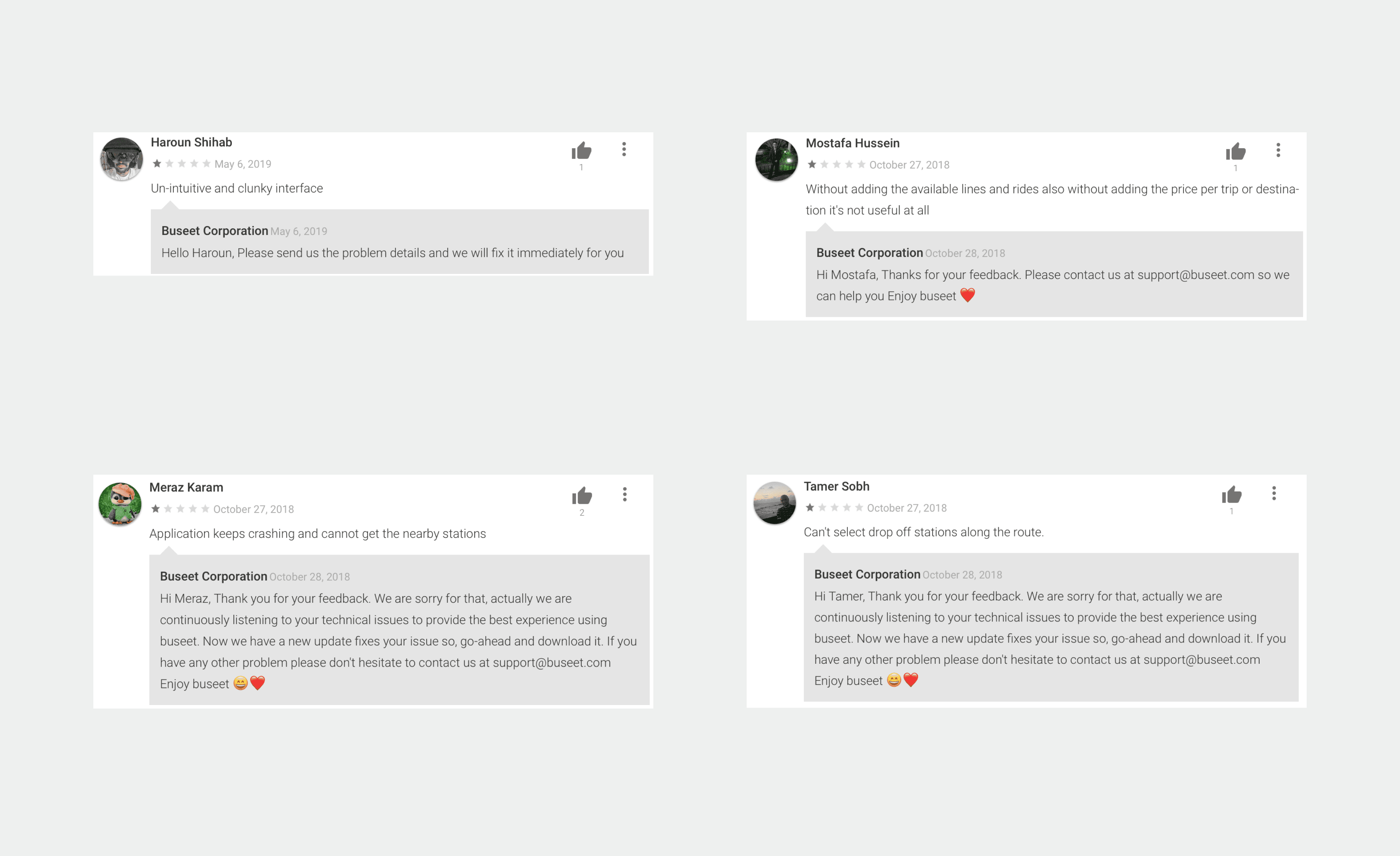
The redesign focused on helping passengers find a route, book a seat and follow their trip. The experience needed to keep schedules, pickup information and payment clear in the context of a daily commute.
The approach
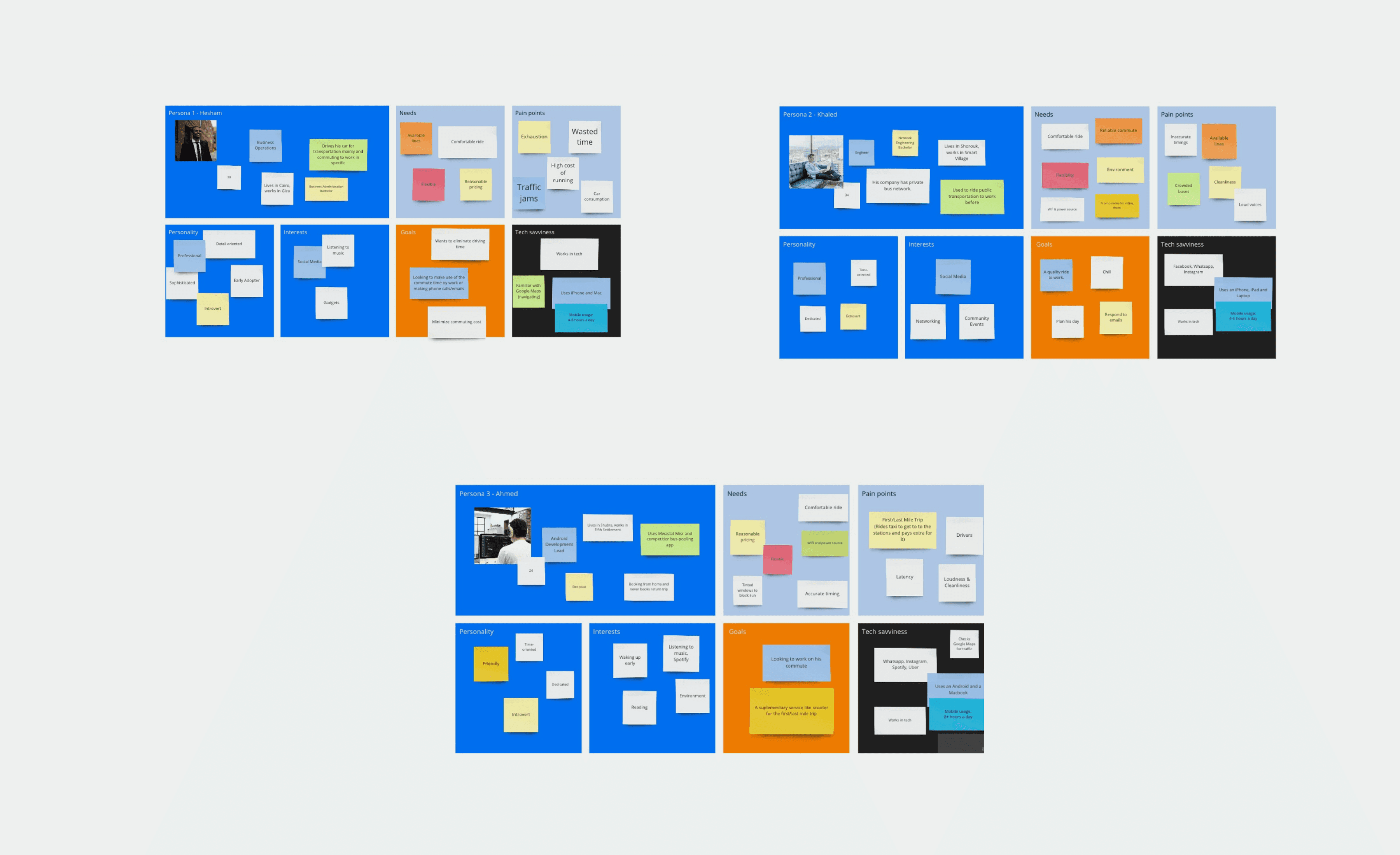
I used a survey and in-person interviews during commutes to understand how passengers planned and travelled. Participants could also opt into a continuing research programme.
A strategy for the journey
The strategy centred on the passenger’s context and the actions needed at each stage of the trip.
Route information, arrival times, ticketing and payment were brought into the journey. The design considered where a passenger would be and what they would need at that moment.
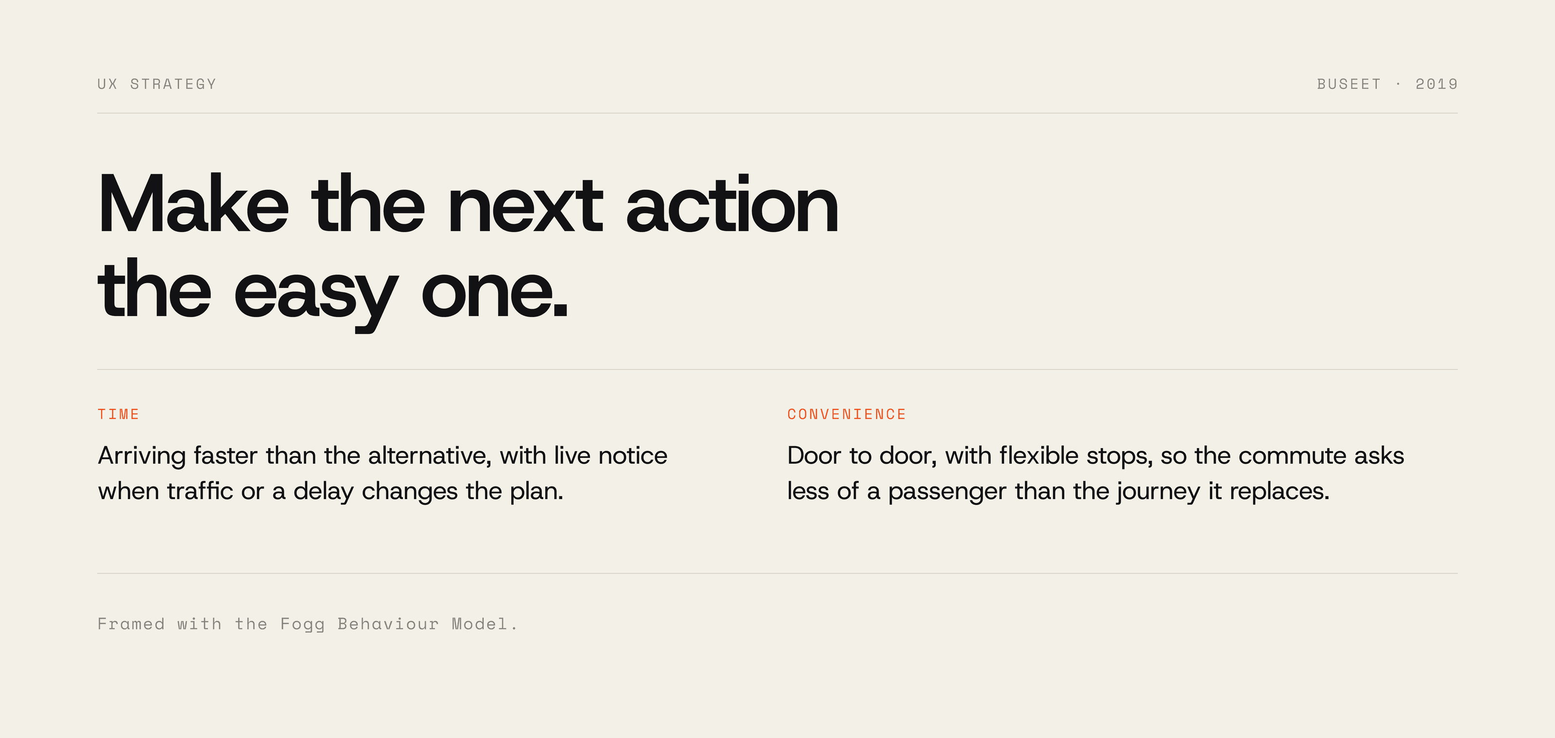
The Fogg Behaviour Model helped frame the tasks we wanted to make easier to act on.
Information at a glance
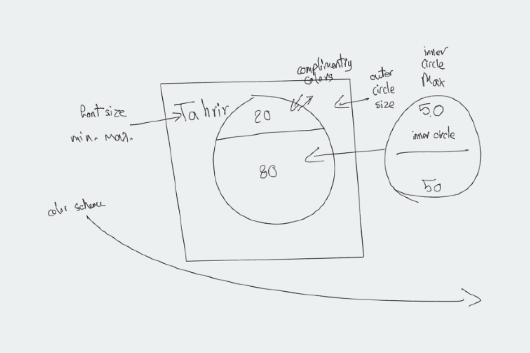
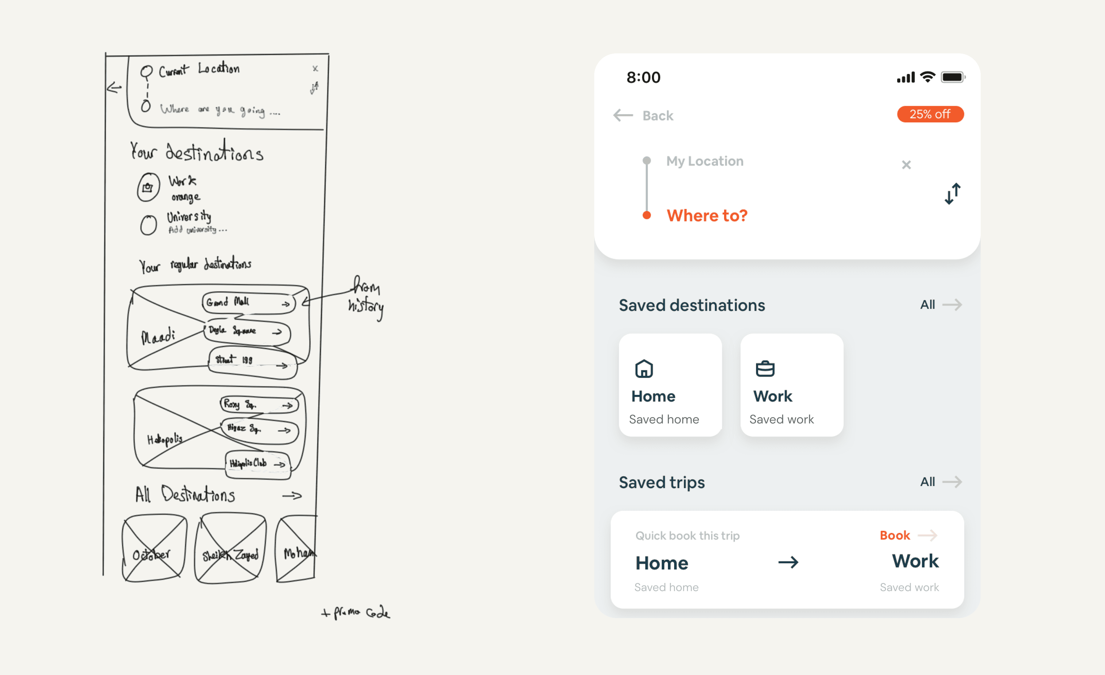
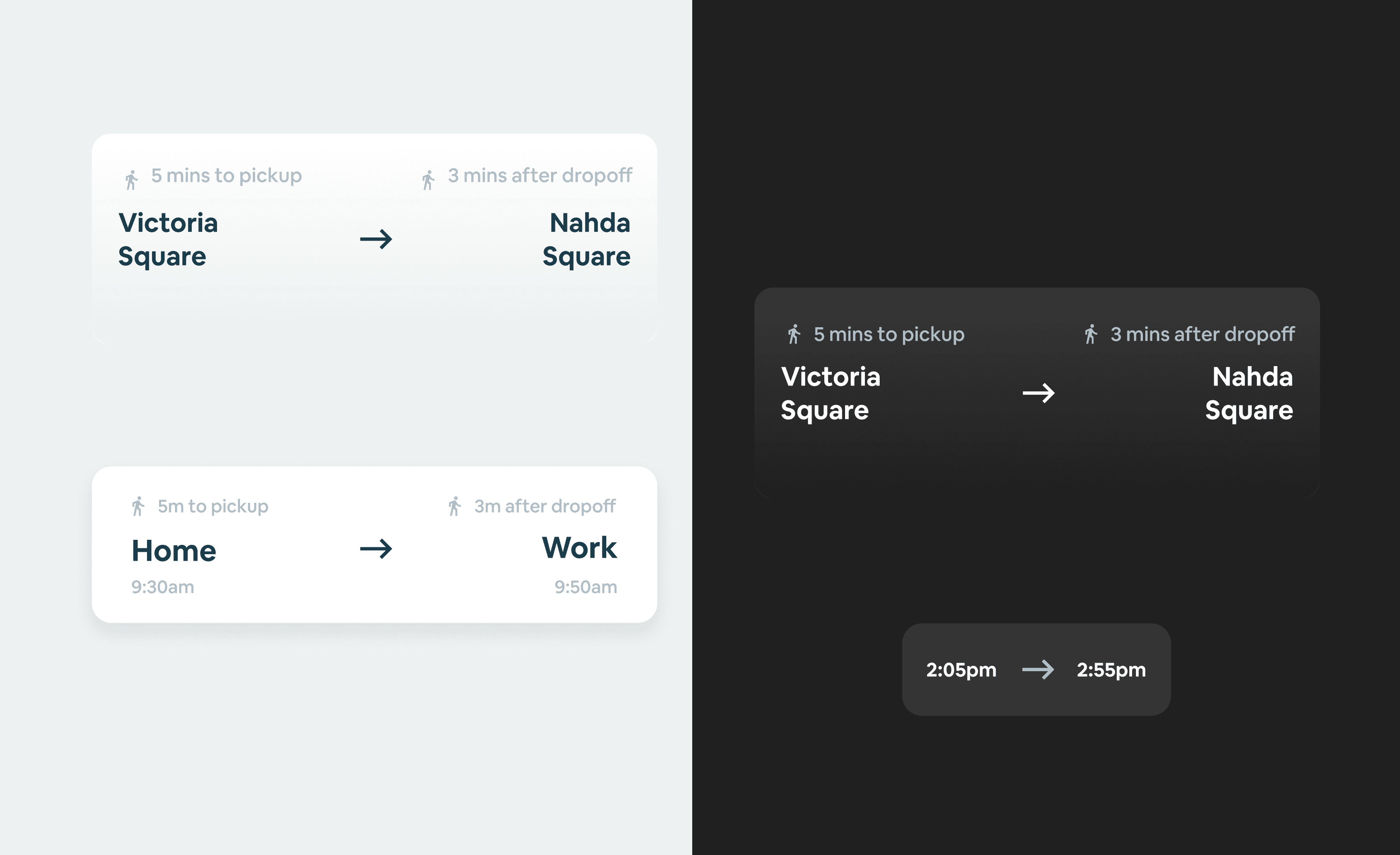
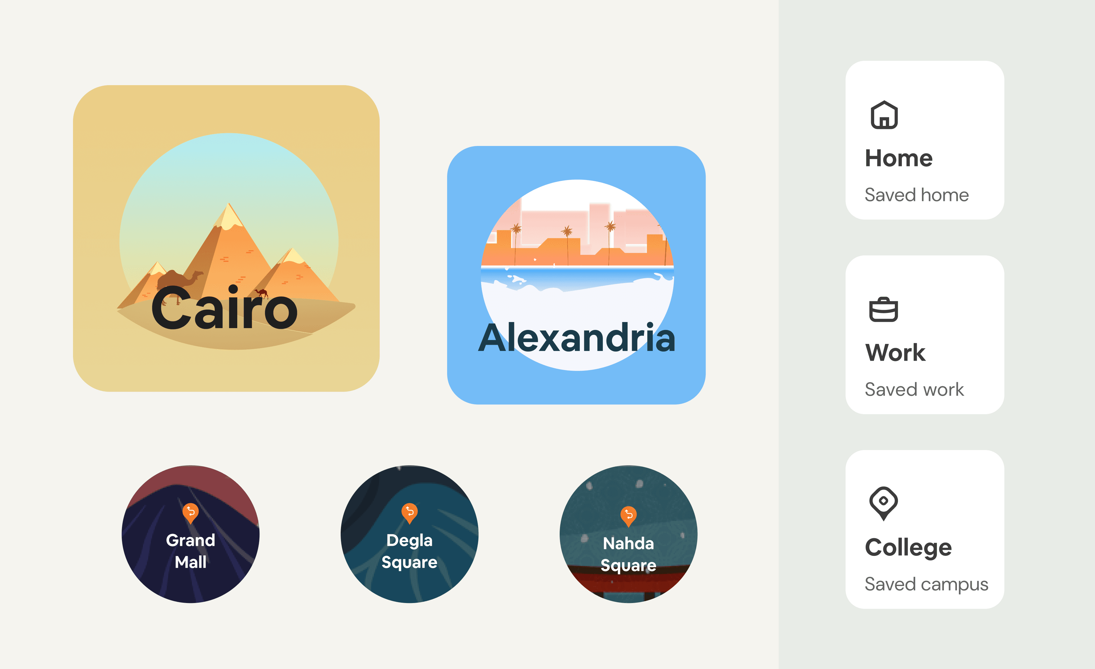
Cards drew on the clarity of transport signs and tickets. Concise labels, imagery and status cues helped organise information for use on the move. The first sketch set the station name’s type size, the card’s circles and a complementary colour scheme.
Shared ideation
I facilitated a cross-functional sketching workshop. Participants developed ideas individually, shared them, iterated and brought the proposals together for review.


The experience
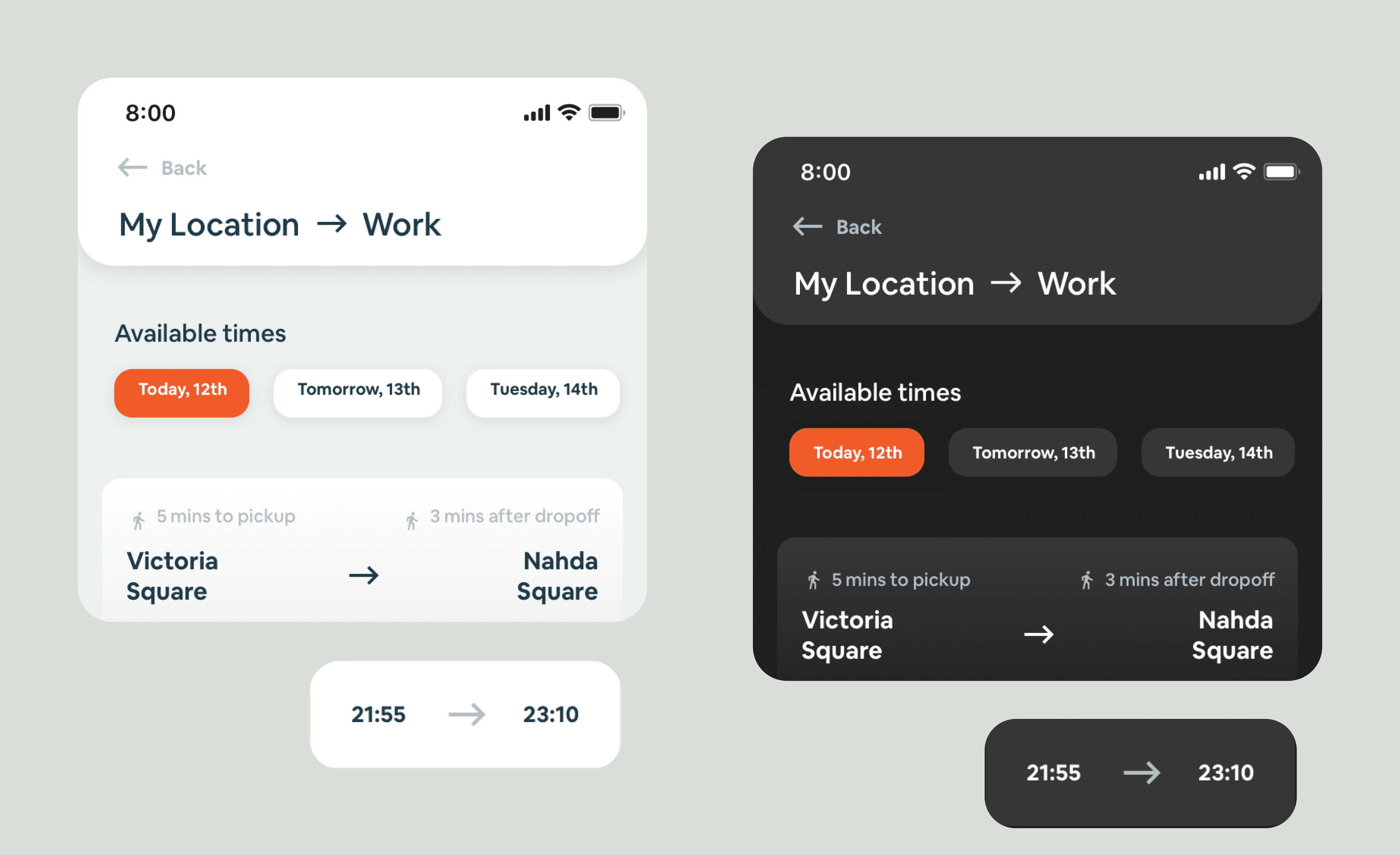
The interface uses concise information, imagery and colour to distinguish trip and booking states.
A contextual home
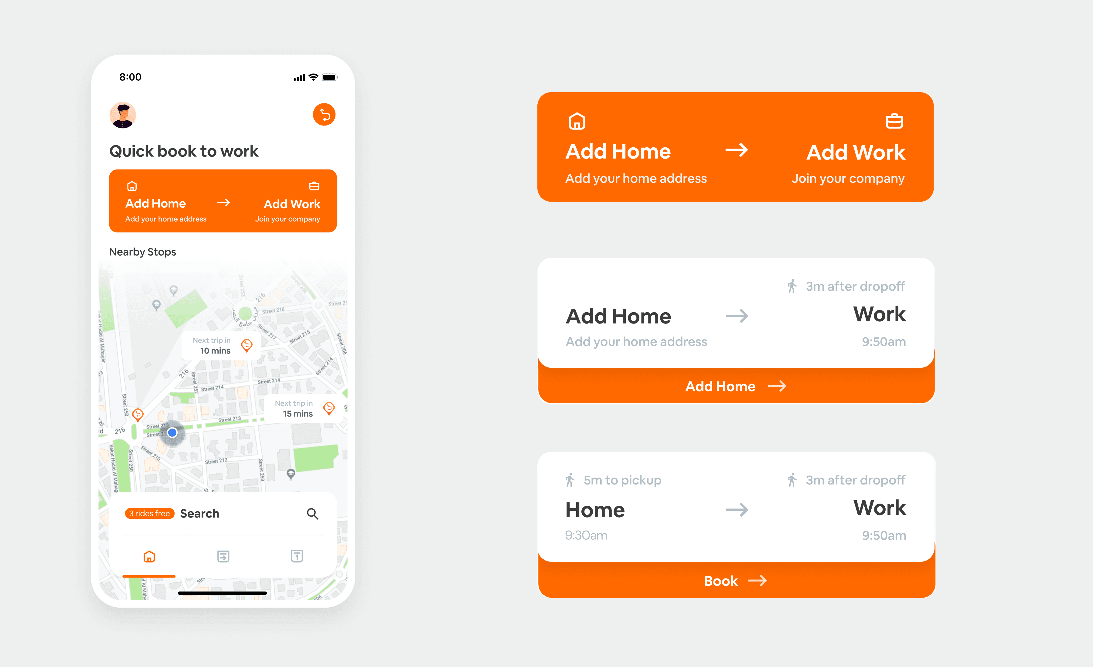
The home experience asks for the passenger’s address and can use a registered company address to support trip planning.
Nearby stops and destinations
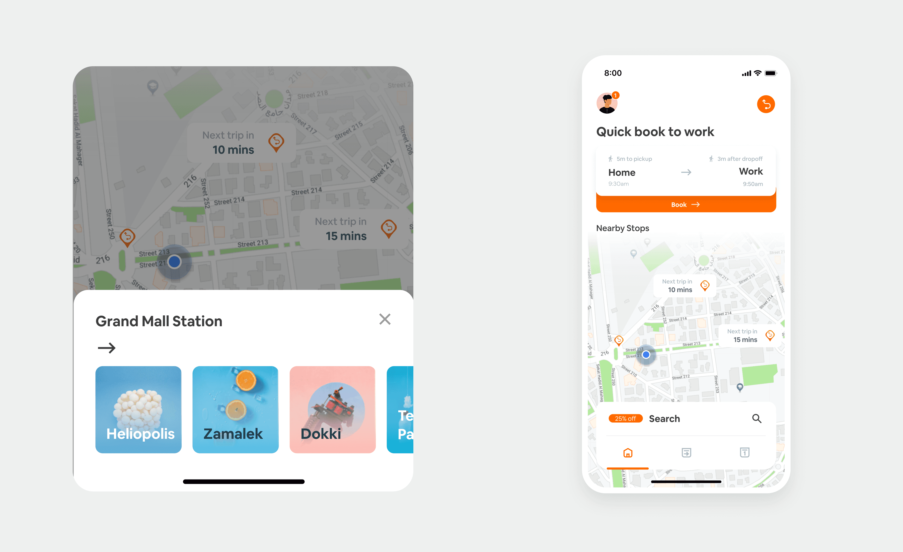
With an address and location access, home shows nearby stops. Selecting a stop reveals the available destinations.
Before, during and after the trip
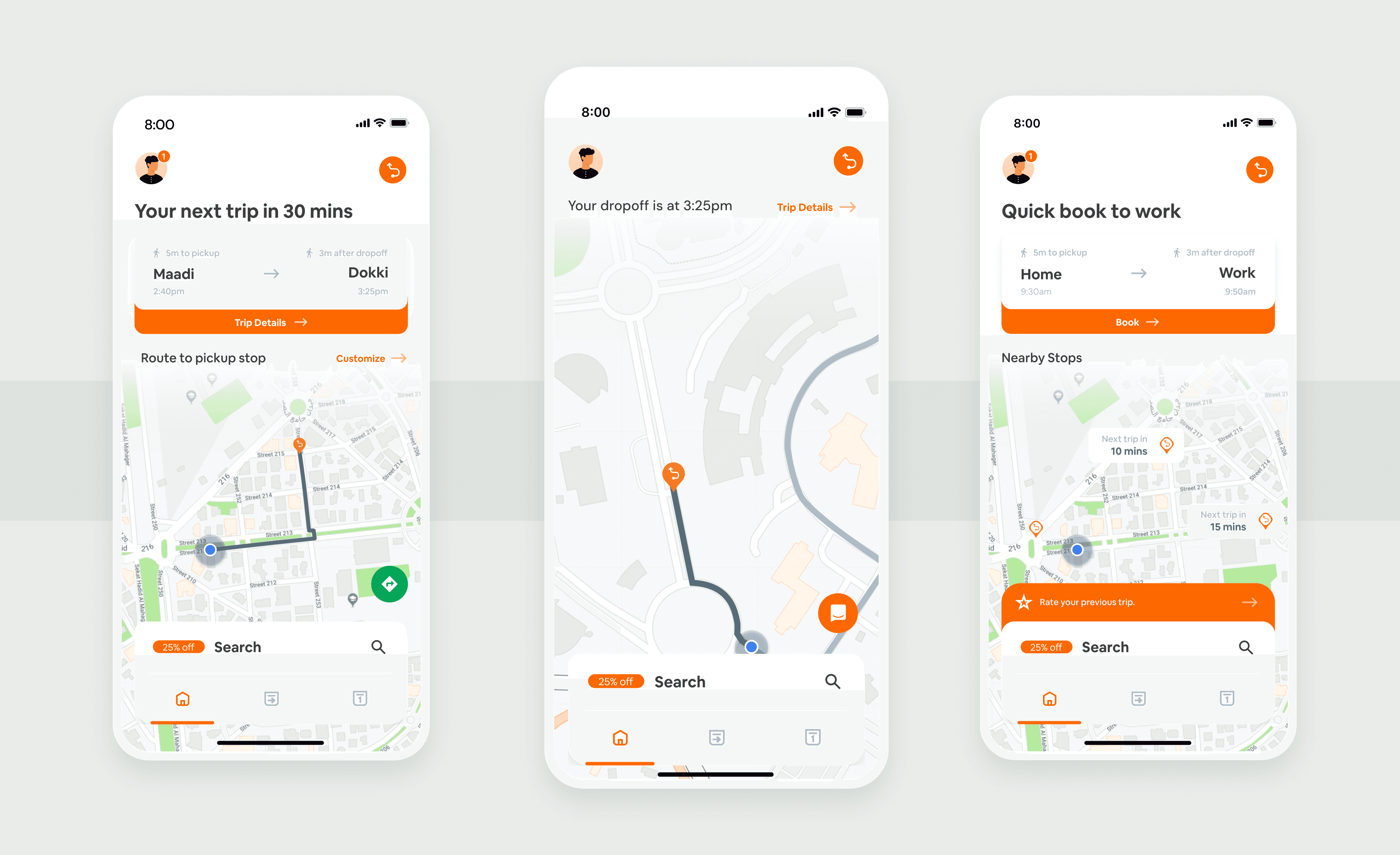
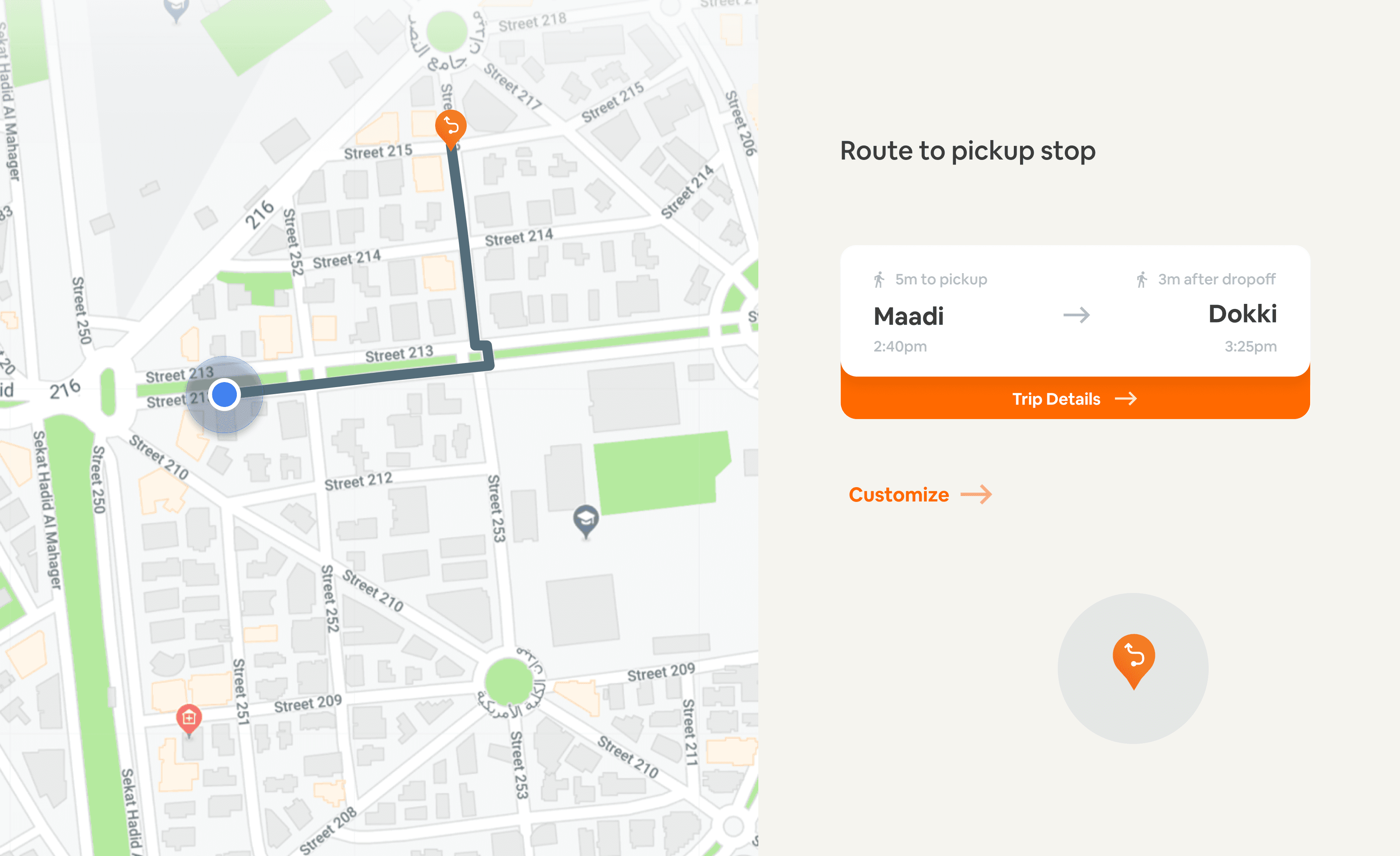
Before a trip, passengers can check the pickup route and timing or open navigation. During the trip, they can follow the route and expected arrival. Afterwards, the app asks for a rating.
The outcome
The redesigned app launched. In the first week after the iOS release, booking conversion rose by 15 percentage points compared with the week before. The work connected planning, booking and trip guidance in a shared mobile experience.



Credits
Product design and UX research: Sayed Essam. Company: buseet.
The challenge
The redesign focused on helping passengers find a route, book a seat and follow their trip. The experience needed to keep schedules, pickup information and payment clear in the context of a daily commute.
The approach
I used a survey and in-person interviews during commutes to understand how passengers planned and travelled. Participants could also opt into a continuing research programme.
A strategy for the journey
The strategy centred on the passenger’s context and the actions needed at each stage of the trip.
Route information, arrival times, ticketing and payment were brought into the journey. The design considered where a passenger would be and what they would need at that moment.
The Fogg Behaviour Model helped frame the tasks we wanted to make easier to act on.
Information at a glance
Cards drew on the clarity of transport signs and tickets. Concise labels, imagery and status cues helped organise information for use on the move. The first sketch set the station name’s type size, the card’s circles and a complementary colour scheme.
Shared ideation
I facilitated a cross-functional sketching workshop. Participants developed ideas individually, shared them, iterated and brought the proposals together for review.
The experience
The interface uses concise information, imagery and colour to distinguish trip and booking states.
A contextual home
The home experience asks for the passenger’s address and can use a registered company address to support trip planning.
Nearby stops and destinations
With an address and location access, home shows nearby stops. Selecting a stop reveals the available destinations.
Before, during and after the trip
Before a trip, passengers can check the pickup route and timing or open navigation. During the trip, they can follow the route and expected arrival. Afterwards, the app asks for a rating.
The outcome
The redesigned app launched. In the first week after the iOS release, booking conversion rose by 15 percentage points compared with the week before. The work connected planning, booking and trip guidance in a shared mobile experience.
Credits
Product design and UX research: Sayed Essam. Company: buseet.